---
title: "Onboarding components"
description: "Use Adyen's prebuilt UI components to collect information from your users as part of your onboarding flow."
url: "https://docs.adyen.com/issuing/onboard-users/components"
source_url: "https://docs.adyen.com/issuing/onboard-users/components.md"
canonical: "https://docs.adyen.com/issuing/onboard-users/components"
last_modified: "2026-05-24T12:54:31+02:00"
language: "en"
---
# Onboarding components
Use Adyen's prebuilt UI components to collect information from your users as part of your onboarding flow.
[View source](/issuing/onboard-users/components.md)
The Onboarding components are only compatible with the legal entities created with v3 or v4 of the [Legal Entity Management API](https://docs.adyen.com/api-explorer/legalentity/latest/overview).
To onboard and verify users, you need to create a user interface (UI) to collect user data. To speed up building your integration, Adyen offers Onboarding components. You can integrate these components into your platform’s UI to let your users enter their data. The component then uses the entered data to create the relevant resource. This means you do not need to implement the API call to create the resource yourself.
We recommend using the Onboarding components in your [API-only onboarding flow](/issuing/onboard-users) to reduce engineering efforts and speed up implementation. It is important to note that the Onboarding components only cover certain functionality, and you still need to implement API calls for other parts of your API-only onboarding flow.
Here are some scenarios where the Onboarding components can be particularly useful:
* You are developing your UI to onboard users with [API-only onboarding](/issuing/onboard-users#api-only-onboarding) and want to speed up the process.
* You have already built your UI to onboard users with [API-only onboarding](/issuing/onboard-users#api-only-onboarding) and want to reduce the effort required to maintain your code.
* You are using [hosted onboarding](/issuing/onboard-users#hosted-onboarding) to onboard users and want to let users manage their submitted data directly in your UI.
You can integrate the following Onboarding components:
* **Transfer Instrument components**: provide users with full control over their bank accounts (transfer instruments). Users can create new accounts using instant verification or document uploads, and manage existing ones, including viewing verification statuses. By integrating these components, your users can enter bank details directly, which automatically creates the transfer instrument resource without requiring you to make any separate API calls.
The guidance and features available may differ based on the library version in use. We recommend using the latest library version to take advantage of the newest features and improvements.
Ensure you select a version in the next section before starting your integration.
## Transfer Instrument components
Use Adyen's prebuilt UI components to collect information from your users as part of your onboarding flow.
## Requirements
Before you begin, take into account the following requirements and preparations.
| Requirement | Description |
| -------------------- | ----------------------------------------------------------------------------------------------------------------------------------------------------------------------------------------------------------------------------------------------------------------------------------------------------------------------------------------------------------------------------------------------------------------------------------------------------------- |
| **Integration type** | You must have an Adyen Issuing integration. |
| **API credentials** | You must have a [Legal Entity Management API key](/platforms/manage-access/api-credentials-web-service?tab=create-lem_2) (for example, **ws\[\_123456]@Scope.Company\_\[YourCompanyAccount]**) to access the [Session authentication API](https://docs.adyen.com/api-explorer/sessionauthentication/latest/overview). |
| **Setup steps** | Before you begin:- Verify that the component is available in the [languages](#supported-languages) and [browser versions](/platforms/components-overview#supported-browsers) that apply to your situation.
- Follow the [API-only onboarding](/platforms/onboard-users/onboarding-steps) guide to complete all necessary steps before creating transfer instruments.
- Review our guidance on the [verification process](/platforms/verification-overview). |
### Component-Description
## Transfer Instrument Configuration component
The **Transfer Instrument Configuration** component enables users to add information about their bank accounts, also known as transfer instruments. Users can either give permission for the [instant verification](/platforms/onboard-users#instant-bank-account-verification) of their bank account, or upload documents which Adyen uses to validate the bank account.
The following tabs illustrate how the component appears on various screen sizes.
### Tab: Mobile
[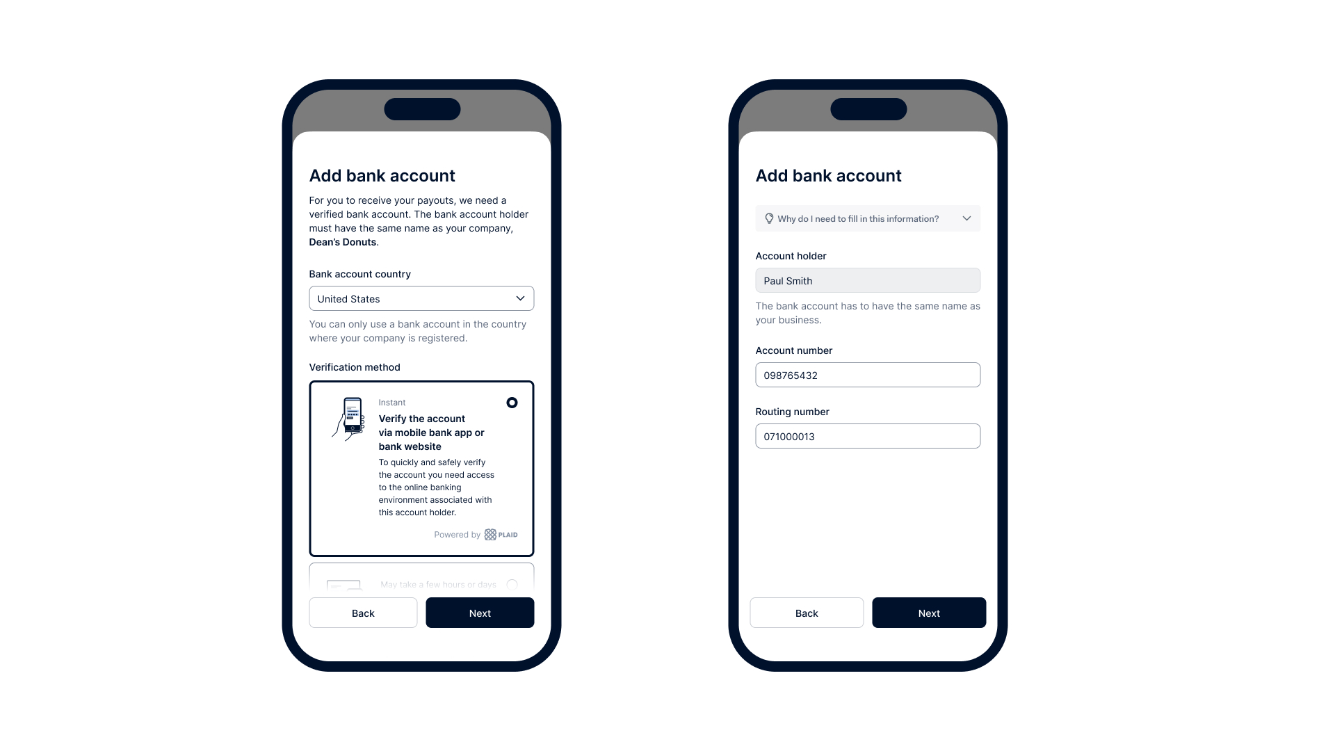](/user/pages/filters/onboarding-components-issuing/transfer-instrument/4-0-0/component-description/transfer-instrument-configuration-mobile.jpg)
### Tab: Desktop
[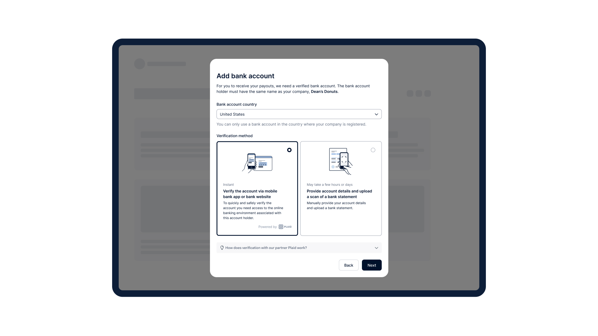](/user/pages/filters/onboarding-components-issuing/transfer-instrument/4-0-0/component-description/transfer-instrument-configuration-desktop.jpg)
## Transfer Instrument Management component
The **Transfer Instrument Management** component enables users to view a list of all bank accounts (transfer instruments) that have been added, along with their corresponding verification statuses and error messages, if applicable.
Users can also add a new bank account or delete an existing one if it is no longer needed. Any changes made are applied immediately, ensuring that payouts are delivered to the correct transfer instrument. If a bank account still needs to be added, users will be prompted to do so when accessing the component. Learn how to use the events emitted to create a complete [user flow](#user-flow-and-events).
The following tabs illustrate how the component appears on various screen sizes.
### Tab: Mobile
[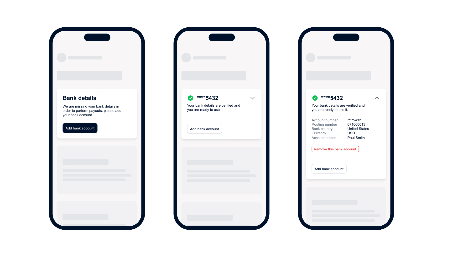](/user/pages/filters/onboarding-components-issuing/transfer-instrument/4-0-0/component-description/transfer-instrument-management-mobile.jpg)
### Tab: Desktop
[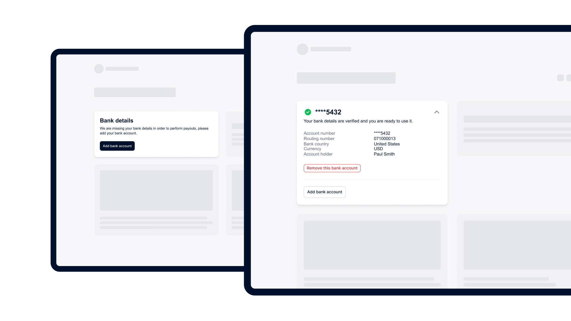](/user/pages/filters/onboarding-components-issuing/transfer-instrument/4-0-0/component-description/transfer-instrument-management-desktop.jpg)
## How it works
Follow these steps to integrate the transfer instrument components:
1. [Create an authentication session from your server](#create-token)
2. [Install component library in your front end](#install-library)
3. [Configure component properties](#configure-component-properties)
4. [Customize component appearance](#customize-appearance)
### Create-A-Session
## 1. Create an authentication session from your server
To ensure secure communication between components and Adyen server, you must configure your server for authentication and create a session token. To create the token:
1. From your server, make a POST [/sessions](https://docs.adyen.com/api-explorer/sessionauthentication/latest/post/sessions) request using the API key that you set up for the [Legal Entity Management API](https://docs.adyen.com/api-explorer/legalentity/latest/overview). In the request body, specify these parameters:
| Parameter | Required | Description | Example |
| ----------------------------------------------------------------------------------------------------------------- | ------------------------------------------------------------------------------------------- | ----------------------------------------------------------------------------------------------------------------------------------------------------------------------------------------------------------------------------------------------------------------------------------------------------------------------------------------------------------------------------------------------------------------------------------------------------------------------------------------------------------------------------------------------------------------------------------------------------------------------------------------------------------------------------------------------------------------------------------------------------------------------------------------------------------------------------------------------- | ---------------------------------------------------------------------------------------------------------------------------------------------------------------------------------------------------- |
| [allowOrigin](https://docs.adyen.com/api-explorer/sessionauthentication/latest/post/sessions#request-allowOrigin) |  | The URL where the component will appear. | Must follow the format of `https://www.yourcompany.com`, where `yourcompany.com` is the actual web address of your platform. Can include a subdomain. On live, only the HTTPS protocol is supported. |
| [policy](https://docs.adyen.com/api-explorer/sessionauthentication/latest/post/sessions#request-policy) |  | An object that contains:- [resources](https://docs.adyen.com/api-explorer/sessionauthentication/latest/post/sessions#request-policy-resources): An object that contains:
* `legalEntityId`: The unique identifier of the legal entity that has the contractual relationship with your platform and owns the bank account. For sole proprietorships, this is the legal entity ID of the individual owner.
* [type](https://docs.adyen.com/api-explorer/sessionauthentication/latest/post/sessions#request-policy-resources-type): The type of resource. Set this to **legalEntity**.
- [roles](https://docs.adyen.com/api-explorer/sessionauthentication/latest/post/sessions#request-policy-roles): The role(s) required to use the component(s). Set this to **transferInstrumentConfiguration** and/or **transferInstrumentManagement** | |
| [product](https://docs.adyen.com/api-explorer/sessionauthentication/latest/post/sessions#request-product) |  | The type of product the component belongs to. | Set this to **onboarding**. |
Here is an example request for creating a session token.
**Create a session token**
```bash
curl https://test.adyen.com/authe/api/v1/sessions \
-H 'content-type: application/json' \
-H 'x-api-key: ADYEN_LEGAL_ENTITY_MANAGEMENT_API_KEY' \
-D '{
"allowOrigin":"https://yourcompany.com",
"product":"onboarding",
"policy": {
"resources": [
{
"legalEntityId": "LE00000000000000000000001",
"type": "legalEntity"
}
],
"roles": [
"transferInstrumentConfiguration",
"transferInstrumentManagement"
]
}
}'
```
2. Note the API response. Later, when [configuring the components](#configure-component-properties), you need to create and call a function that passes the entire session object from the response to your front end. Additionally, you need to pass the `token` value to the `sdkToken` parameter.
**Session token created**
```json
{
"id": "EC1234-1234-1234-1234",
"token": "xxxxx.yyyyy.zzzzzz"
}
```
### Install-Component-Library
## 2. Install component library in your front end
Install the **Adyen KYC Components** library in your front-end application as follows:
1. Install the npm package.
```bash
npm install @adyen/kyc-components --save
```
2. Import the component you need.
```bash
import '@adyen/kyc-components/transfer-instrument';
```
Simply by importing the module, the web component is automatically registered and ready for use.
### Configure-Components
## 3. Configure component properties
1. Select the tab for the component you want to use:
### Tab: Transfer Instrument Configuration component
| Parameter | Required | Description | Example |
| ---------------------------- | ------------------------------------------------------------------------------------------------------ | ------------------------------------------------------------------------------------------------------------------------------------------------------------------------------------------------------------------------------------------------------------------------------------------------------------------------------------------------------------------------------- | -------------------------------------------------------------------------------- |
| `environment` |  | The URL of the environment for the component integration. | Use `test` for the test environment and `live` for the live environment. |
| `fetchToken` |  | The [callback function](#create-token) that retrieves an authentication session token and refreshes the current session. | |
| `locale` |  | The language of the component. See the list of [supported languages](#supported-languages). | Use **en-US** for English. |
| `rootlegalentityid` |  | The unique identifier of the legal entity to which the transfer instrument belongs. | **LE00000000000000000000001** |
| `complete` | | The [callback function](#callback-functions) triggered when the transfer instrument is successfully submitted and the component has finished its task. | `(submittedData) => {}` |
| `openBankingPartnerConfigId` |  For US, CA | The unique identifier of your brand name shown to your user during instant bank account verification. They can initiate the verification process through open banking providers, like Plaid or Tink. | To customize the parameter value, reach out to your Adyen contact. |
| `settings` | | An object that contains:- `allowIntraRegionCrossBorderPayout`: if set to **true**, users can select a payout account in a different EU/EEA country (including Switzerland and the UK) than the country of their legal entity.
- `allowBankAccountFormatSelection`: if set to **true**, users can choose between a local format or IBAN for their payout account, if applicable. | `allowIntraRegionCrossBorderPayout:true` `allowBankAccountFormatSelection:false` |
| `transferInstrumentId` | | The unique identifier of the transfer instrument. When the parameter is passed, the component shows information about this transfer instrument. | **SE00000000000000000000001** |
### Tab: Transfer Instrument Management component
| Parameter | Required | Description | Example |
| ------------------- | ------------------------------------------------------------------------------------------- | ------------------------------------------------------------------------------------------------------------------------------ | ----------------------------------------------------------------------------------------------------------------------------------------------- |
| `environment` |  | Refers to the application environment The URL of the environment for the component integration. | Use [test](https://test.adyen.com/) for the test environment and [live](https://onboardingcomponents-live.adyen.com/) for the live environment. |
| `fetchToken` |  | The [callback function](#callback-functions) that retrieves an authentication session token and refreshes the current session. | |
| `locale` |  | The language of the component. See the list of [supported languages](#supported-languages). | Use **en-US** for English. |
| `rootlegalentityid` |  | The unique identifier of the legal entity to which the transfer instrument belongs. | **LE00000000000000000000001** |
| `add` |  | The [callback function](#callback-functions) triggered when the user selects **Add bank account**. | `(legalEntityId) => {}` |
| `edit` |  | The [callback function](#callback-functions) triggered when the user selects **Edit details**. | `(transferInstrumentId, legalEntityId) => {}` |
| `remove` | | The callback function triggered when the transfer instrument is removed. | `(transferInstrumentId, legalEntityId) => {}` |
2. Add a function that [calls your API](#create-token) to retrieve and refresh an authentication session token.
Select the tab for the component you want to use:
### Tab: Transfer Instrument Configuration component
**Add function to refresh a session token**
```javascript
function fetchToken() {
return fetch('https://api.yourcompany.com/adyen-onboarding-sdk-token',
{ "policy": { "roles": ["transferInstrumentConfiguration"] } });
}
```
### Tab: Transfer Instrument Management component
**Add function to refresh a session token**
```javascript
function fetchToken() {
return fetch('https://api.yourcompany.com/adyen-onboarding-sdk-token',
{ "policy": { "roles": ["transferInstrumentManagement"] } });
}
```
3. Add the component in your template, for example in HTML, JSX, or Vue.
Be sure to include the function for retrieving and refreshing the session token that you added in the previous step. In this step, you can also configure the components to use one of the [supported languages](#supported-languages) by setting the `locale` parameter. If no localization settings are provided, the components will default to English.
1. For **Transfer Instrument Configuration** component, select the tab below corresponding to the framework you are using:
### Tab: HTML
**Configure library and create component**
```html
```
### Tab: React
**Configure library and create component**
```jsx
const oncomplete = (data) => {
console.log("submitted the transfer instrument with:", data);
};
```
### Tab: Vue
**Configure library and create component**
```html
```
2. For **Transfer Instrument Management** component, select the tab below corresponding to the framework you are using:
### Tab: HTML
**Configure library and create component**
```html
```
### Tab: React
**Configure library and create component**
```jsx
const onAdd = (rootLegalEntityId: string) => {
console.log("User wants to add a transfer instrument");
};
const onRemove = (transferInstrumentId: string, rootLegalEntityId: string) => {
console.log("User wants to remove a transfer instrument");
};
const onEdit = (transferInstrumentId: string, rootLegalEntityId: string) => {
console.log("User wants to edit a transfer instrument");
};
```
### Tab: Vue
**Configure library and create component**
```html
```
### Customize-Appearance
## 4. (Optional) Customize component appearance
You can customize the appearance of your components by overriding the default values of CSS variables.
For the best user experience when customizing components, we recommend the following:
* Choose color combinations that complement each other well and provide enough contrast for readability, especially for text and navigation elements.
* Follow accessibility guidelines to ensure that the color palette is inclusive and usable for individuals with visual impairments.
* Test your customizations before implementing them live.
The following tabs show the available CSS variables and their default values.
### Tab: Font
**Default font settings**
```css
/** Font family */
--adyen-sdk-text-body-font-family: "Inter; Roboto; Oxygen; 'Open Sans'; 'Helvetica Neue'; Arial; sans-serif";
--adyen-sdk-text-caption-font-family: "Inter; Roboto; Oxygen; 'Open Sans'; 'Helvetica Neue'; Arial; sans-serif";
--adyen-sdk-text-title-font-family: "Inter; Roboto; Oxygen; 'Open Sans'; 'Helvetica Neue'; Arial; sans-serif";
--adyen-sdk-text-title-m-font-family: "Inter; Roboto; Oxygen; 'Open Sans'; 'Helvetica Neue'; Arial; sans-serif";
--adyen-sdk-text-title-l-font-family: "Inter; Roboto; Oxygen; 'Open Sans'; 'Helvetica Neue'; Arial; sans-serif";
/** Font size */
--adyen-sdk-text-caption-font-size: 12px;
--adyen-sdk-text-body-font-size: 14px;
--adyen-sdk-text-title-font-size: 16px;
--adyen-sdk-text-title-mobile-font-size: 16px;
--adyen-sdk-text-title-m-mobile-font-size: 18px;
--adyen-sdk-text-title-m-font-size: 20px;
--adyen-sdk-text-title-l-mobile-font-size: 20px;
--adyen-sdk-text-title-l-font-size: 24px;
/** Font weight */
--adyen-sdk-text-body-font-weight: 400;
--adyen-sdk-text-caption-font-weight: 400;
--adyen-sdk-text-body-stronger-font-weight: 500;
--adyen-sdk-text-caption-stronger-font-weight: 500;
--adyen-sdk-text-body-strongest-font-weight: 600;
--adyen-sdk-text-title-font-weight: 600;
--adyen-sdk-text-title-m-font-weight: 600;
--adyen-sdk-text-title-l-font-weight: 600;
/** Line height */
--adyen-sdk-text-caption-line-height: 18px;
--adyen-sdk-text-body-line-height: 20px;
--adyen-sdk-text-title-line-height: 26px;
--adyen-sdk-text-title-mobile-line-height: 26px;
--adyen-sdk-text-title-m-mobile-line-height: 28px;
--adyen-sdk-text-title-m-line-height: 30px;
--adyen-sdk-text-title-l-mobile-line-height: 30px;
--adyen-sdk-text-title-l-line-height: 34px;
/** Primary font color - main font color for components */
--adyen-sdk-color-label-primary: #00112c;
--adyen-sdk-color-label-primary-hover: #5c687c;
--adyen-sdk-color-label-primary-active: #8d95a3;
/** Secondary font color - secondary font color (ex. helper text, captions) */
--adyen-sdk-color-label-secondary: #5c687c;
/** Tertiary font color - tertiary font color (ex. field placeholder text) */
--adyen-sdk-color-label-tertiary: #8d95a3;
/** Highlight font color - pop of color (ex. current form step indicator) */
--adyen-sdk-color-label-highlight: #0070f5;
/** Inverse primary font color - ex. button text color */
--adyen-sdk-color-label-inverse-primary: #ffffff;
--adyen-sdk-color-label-inverse-primary-hover: #f7f7f8;
--adyen-sdk-color-label-inverse-primary-active: #eeeff1;
--adyen-sdk-color-label-inverse-secondary: #9ea6b1;
/** Link font color - sets color of links */
--adyen-sdk-color-link-primary: #00112c;
--adyen-sdk-color-link-primary-hover: #5c687c;
--adyen-sdk-color-link-primary-active: #8d95a3;
--adyen-sdk-color-link-primary-disabled: #8d95a3;
```
### Tab: Background color
**Default background color settings**
```css
/** Primary background - sets bg color for cards, form fields, task list */
--adyen-sdk-color-background-primary: #ffffff;
--adyen-sdk-color-background-primary-hover: #f7f7f8;
--adyen-sdk-color-background-primary-active: #eeeff1;
/** Secondary background - sets bg color for actions menu, accordion, default alert, etc. */
--adyen-sdk-color-background-secondary: #f7f7f8;
--adyen-sdk-color-background-secondary-hover: #eeeff1;
--adyen-sdk-color-background-secondary-active: #e3e5e9;
/** Tertiary background - sets bg color for text buttons */
--adyen-sdk-color-background-tertiary: #eeeff1;
--adyen-sdk-color-background-tertiary-hover: #e3e5e9;
--adyen-sdk-color-background-tertiary-active: #dbdee2;
/** Inverse primary background - main button, radio, and checkbox colors */
--adyen-sdk-color-background-inverse-primary: #00112c;
--adyen-sdk-color-background-inverse-primary-hover: #5c687c;
--adyen-sdk-color-background-inverse-primary-active: #8d95a3;
```
### Tab: Outline color
**Default outline color settings**
```css
/** Primary outline - sets border color for cards, modal dividers, etc. */
--adyen-sdk-color-outline-primary: #dbdee2;
--adyen-sdk-color-outline-primary-hover: #c9cdd3;
--adyen-sdk-color-outline-primary-active: #00112c;
/** Secondary outline - sets border color for dropzone and buttons */
--adyen-sdk-color-outline-secondary: #c9cdd3;
--adyen-sdk-color-outline-secondary-hover: #b8bdc6;
--adyen-sdk-color-outline-secondary-active: #00112c;
/** Tertiary outline - sets border color for form fields (checkbox, input radio, select) */
--adyen-sdk-color-outline-tertiary: #8d95a3;
--adyen-sdk-color-outline-tertiary-hover: #6d7789;
--adyen-sdk-color-outline-tertiary-active: #00112c;
```
### Tab: Border
**Default border settings**
```css
/** Small border radius - for checkboxes and tags */
--adyen-sdk-border-radius-s: 4px;
/** Medium border radius - for input fields, buttons, toasts, task list items */
--adyen-sdk-border-radius-m: 8px;
/** Large border radius - for cards, alerts, modals, action menu */
--adyen-sdk-border-radius-l: 12px;
```
The following tab shows an example of how to style the components.
### Tab: Example 1: Override CSS variables
**style.css**
```css
:root {
/** Setting the default font family to Inter */
--adyen-sdk-text-body-font-family: Inter,sans-serif;
--adyen-sdk-text-caption-font-family: Inter,sans-serif;
--adyen-sdk-text-title-font-family: Inter,sans-serif;
--adyen-sdk-text-title-m-font-family: Inter,sans-serif;
--adyen-sdk-text-title-l-font-family: Inter,sans-serif;
/** Setting the primary inverse background color (ex. main button colors) */
--adyen-sdk-color-background-inverse-primary: #7e5bed;
--adyen-sdk-color-background-inverse-primary-hover: #7e5bed;
--adyen-sdk-color-background-inverse-primary-active: #7e5bed;
/** Setting border radius for buttons and input fields */
--adyen-sdk-border-radius-m: 15px;
```
### Callback-Functions
## User flow and events
When integrating components, you must listen to the events they dispatch. These events inform your application about the user's progress or actions within the component, allowing you to execute specific callback functions to manage the user flow.
* The **Transfer Instrument Configuration** component dispatches a `complete` event. Listening for this event allows you to understand when the user has finished their interaction, enabling you to react accordingly, for example navigating the UI to a new page.
* The **Transfer Instrument Management** component emit multiple events to help you react to granular user actions. For example, this component dispatches three custom events:
* The `add` event: Emitted when the user initiates the action to create a new transfer instrument.
* The `edit` event: Emitted when the user modifies an existing transfer instrument.
* The `remove` event: Emitted when the user deletes a transfer instrument.
See the example data for the `complete` callback function below.
**Example \`complete\` data**
```json
id: "SE322JV223222F5GJVKHH8DTC"
payoutAccountDetails: {
accountHolder: "Shelly Eller",
bankAccountNumber: "12312311",
branchCode: "121121121",
currency: "USD",
}
payoutAccountDocuments: {
bankStatementDocument: null,
description: null,
}
payoutAccountVerification: {
verifiedAccountHolder: "Shelly Eller",
verifiedBankAccountNumber: null,
verifiedBankCountry: "US",
verifiedBankName: null,
verifiedCurrencyCode: null,
}
payoutVerificationMethod: {
bankCountry: "US",
payoutVerificationMethod: "manualVerification",
}
```
## Supported languages
You can localize the Onboarding components by setting one of the following languages.
| Language | Locale code |
| ---------- | ----------- |
| Bulgarian | **bg-BG** |
| Croatian | **hr-HR** |
| Czech | **cs-CZ** |
| Danish | **da-DK** |
| Dutch | **nl-NL** |
| English | **en-US** |
| Estonian | **et-EE** |
| Finnish | **fi-FI** |
| French | **fr-FR** |
| German | **de-DE** |
| Greek | **el-GR** |
| Hungarian | **hu-HU** |
| Italian | **it-IT** |
| Latvian | **lv-LV** |
| Lithuanian | **lt-LT** |
| Norwegian | **no-NO** |
| Polish | **pl-PL** |
| Portuguese | **pt-PT** |
| Romanian | **ro-RO** |
| Slovak | **sk-SK** |
| Slovenian | **sl-SI** |
| Spanish | **es-ES** |
| Swedish | **sv-SE** |
## See also
* [Onboarding steps](/issuing/onboard-users/onboarding-steps)
* [Component libraries](/issuing/components-overview)