---
title: "Report components"
description: "Use Platform Experience components to build interactive dashboards for your users."
url: "https://docs.adyen.com/marketplaces/components-overview/after-payment/reports-component"
source_url: "https://docs.adyen.com/marketplaces/components-overview/after-payment/reports-component.md"
canonical: "https://docs.adyen.com/marketplaces/components-overview/after-payment/reports-component"
last_modified: "2026-09-15T14:06:03+02:00"
language: "en"
---
# Report components
Use Platform Experience components to build interactive dashboards for your users.
##### Learn more
 [View our repository on GitHub](https://github.com/Adyen/adyen-platform-experience-web)
 [Try it out with a live demo](https://demotool.adyen.com/se/pie/platform-tx)
 [Explore the latest updates](/release-notes/platforms-and-financial-products)
The report component enables report management within a portal's user interface (UI) with minimal engineering effort. This component integrates the features required to filter and retrieve reports without making multiple API requests. This removes the need to implement complex API calls to filter and download available reports for a specific balance account to ensure access to the most current data.
Additionally, the components provide greater flexibility for data customization. These components can be customized with your own custom fields, icons, links, and buttons, allowing the UI to align with your specific business needs.\
This page provides guidance on:
* The **Report Overview** component.
* Functionalities such as filtering by balance account and daily data generation.
The guidance and features available may differ based on the library version in use. We recommend using the latest library version to take advantage of the newest features and improvements.
Ensure you select a version in the next section before starting your integration.
## Reports component
Use Platform Experience components to build interactive dashboards for your users.
## Requirements
Before you begin, take into account the following requirements, limitations, and preparations.
| Requirement | Description |
| -------------------- | ---------------------------------------------------------------------------------------------------------------------------------------------------------------------------------------------------------------------------------------------------------------------------------------------------------------------------------------------------------------------------------------------------------------------------------------------------------------------------------------------------------------------------------------------------- |
| **Integration type** | You must have the Adyen for Platforms integration. |
| **API credentials** | You must have a [Balance Platform API key](/marketplaces/manage-access/api-credentials-web-service?tab=create-ws_1) (for example, **ws\[\_123456]@BalancePlatform.****\[YourBalancePlatform]**) to access the [Session authentication API](https://docs.adyen.com/api-explorer/sessionauthentication/latest/overview). Ensure that you have asked your Adyen contact to assign the following role to your API credential:- **Reports Overview Component: View** |
| **Limitations** | Currently, the reports component only supports the Payout report. More report types will be added in the future. The Payout report relies on the [Balance Platform Payout report](/platforms/reports-and-fees/payout-report/). The Payout report has several limitations.- It is designed for platforms using [automatic payouts](/marketplaces/custom-payouts/scheduled-payouts) with a default [settlement delay](/platforms/settle-funds/#settlement-delay).
- It does not support manual payouts, pass-through payouts, or sales day payout T+0. |
| **Setup steps** | Before you begin:- Verify that the component is available in the languages that apply to your situation.
- Set up the Balance Platform Payout report to be generated, see [Balance Platform Payout report](/platforms/reports-and-fees/payout-report/) to learn more.
- Check our [Component libraries](/marketplaces/components-overview) page for additional information on the supported countries/regions and browser versions. |
### Component Description
## Reports Overview component
The **Reports Overview** component shows a list of downloadable reports for a specific balance account within a specified time period. Additionally, the component allows for custom data integration, such as your own fields, icons, links, and buttons.
The following tabs illustrate how the component appears on various screen sizes.
### Tab: Mobile
[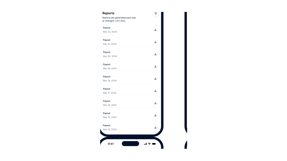](/user/pages/filters/pe-components-dashboards/reports/1-4-0/component-description/reports-mobile.svg)
### Tab: Desktop
[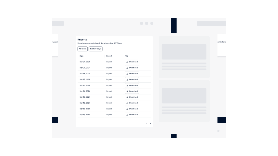](/user/pages/filters/pe-components-dashboards/reports/1-4-0/component-description/reports-desktop.svg)
The component enables users to:
* Download a generated report in CSV format. The downloaded file name will be similar to this: `balanceaccount_payout_report_YYYY_MM_DD.csv`.
* Filter the generated reports by time period and balance account (if applicable). See the [available filters](#available-filters) for more details.
### Supported report types
| Report type | Description |
| ------------- | ----------------------------------------------------------------------------------------------------------------------------------------------------------------------------------------------------------------------- |
| Payout report | This report shows a list of automatic payouts completed for a specific balance account within a specified time period, including details of the transactions (both debits and credits) which are part of these payouts. |
### Available filters
The following sections shows the available filters and their values for the **Reports Overview** component.
**
#### Balance account
Users with multiple balance accounts can switch between them using the **Balance Account** filter.
**
#### Time period
The **Time period** filter specifies the date range for showing available reports. Report data is automatically generated every day at midnight based on the UTC+0 time zone.
| Filter value | Description |
| ---------------- | -------------------------------------------------------------------------------------------------------------- |
| **Last 7 days** | Includes reports from the previous six days and today. |
| **This week** | Includes reports for the current week, starting from Monday midnight until today. |
| **Last week** | Includes reports from Monday midnight to Sunday midnight of the previous week. |
| **Last 30 days** | The default setting. Includes reports from the previous 29 days and today. |
| **This month** | Includes reports for the current month, starting from the first day of the month until today's date. |
| **Last month** | Includes reports from the previous month, starting from the first day of the month until the end of the month. |
| **Year to date** | Includes reports from the first day of the current year up until today's date. |
| **Custom** | Allows setting a custom time period. |
## How it works
The integration of components involves both server-side and client-side processes. You can find more details on the [component libraries](#see-also) page.
### Integration steps
Follow these steps to integrate the component(s):
1. [Create an authentication session from your server](#create-token)
2. [Install component library in your front end](#install-library)
3. [Initialize components](#initialize-components)
4. [Optional: Localize components](#localize-components)
5. [Optional: Customize component appearance](#customize-appearance)
6. [Optional: Customize component data](#customize-data)
### Create A Session
## 1. Create an authentication session from your server
To ensure secure communication between the component and Adyen server, you must configure your server for authentication and create a session token. To create the token:
1. From your server, make a POST [/sessions](https://docs.adyen.com/api-explorer/sessionauthentication/latest/post/sessions) request specifying the following parameters:
To make this API request, your API key must have the **Reports Overview Component: View** role in your Customer Area. For more information, refer to the [Requirements](#requirements) section.
| Parameter | Required | Description |
| ----------------------------------------------------------------------------------------------------------------- | ------------------------------------------------------------------------------------------- | ---------------------------------------------------------------------------------------------------------------------------------------------------------------------------------------------------------------------------------------------------------------------------------------------------------------------------------------------------------------------------------------------------------------------------------------------------------------------------------------------------------------------------------------------------------------------------------------------------------------------------------------------------------------------------------------------------- |
| [allowOrigin](https://docs.adyen.com/api-explorer/sessionauthentication/latest/post/sessions#request-allowOrigin) |  | The URL where the component will appear. Must follow the format of `https://www.yourcompany.com` or `https://*.yourcompany.com`, where `yourcompany.com` is the actual web address of your marketplace. On live, only the HTTPS protocol is supported. |
| [policy](https://docs.adyen.com/api-explorer/sessionauthentication/latest/post/sessions#request-policy) |  | An object that contains:- [resources](https://docs.adyen.com/api-explorer/sessionauthentication/latest/post/sessions#request-policy-resources): An object that contains:
* `accountHolderId`: The unique identifier of the account holder that is linked to the balance account shown in the component.
* [type](https://docs.adyen.com/api-explorer/sessionauthentication/latest/post/sessions#request-policy-resources-type): The type of resource. Set this to **accountHolder**.
- [roles](https://docs.adyen.com/api-explorer/sessionauthentication/latest/post/sessions#request-policy-roles): The role required to use the component. Set this to **Reports Overview Component: View**. |
| [product](https://docs.adyen.com/api-explorer/sessionauthentication/latest/post/sessions#request-product) |  | The type of product the component belongs to. Set this to **platform**. |
Here is an example request for creating a session token.
**Create a session token**
```bash
curl https://test.adyen.com/authe/api/v1/sessions \
-H 'content-type: application/json' \
-H 'x-api-key: ADYEN_BALANCE_PLATFORM_API_KEY' \
-d '{
"allowOrigin":"YOUR_DOMAIN",
"product":"platform",
"policy": {
"resources": [
{
"accountHolderId": "AH00000000000000000000001",
"type": "accountHolder"
}
],
"roles": [
"Reports Overview Component: View"
]
}
}'
```
2. Note the API response. Later, when [initializing the component](#initialize-components), you need to create and call a function that passes the entire session object from the response to your front end.
**Session token created**
```json
{
"id": "EC1234-1234-1234-1234",
"token": "xxxxx.yyyyy.zzzzzz"
}
```
### Install Component Library
## 2. Install component library in your front end
Use the Adyen Web npm package, or embed the Adyen Platform Experience script and stylesheet into your HTML file:
### Tab: npm (recommended)
Install the **Adyen Platform Experience** library in your front-end application as follows:
1. Install the npm package.
```bash
npm install @adyen/adyen-platform-experience-web
```
2. Import the library, the components, and the style sheet.
```bash
import { AdyenPlatformExperience, component_name } from '@adyen/adyen-platform-experience-web';
import "@adyen/adyen-platform-experience-web/adyen-platform-experience-web.css";
```
### Tab: Embed script and stylesheet
Use the `integrity` attribute so browsers can verify that the script and stylesheet have not been changed unexpectedly.
The value of the `integrity` attribute is the [Subresource Integrity (SRI) hash](https://developer.mozilla.org/en-US/docs/Web/Security/Subresource_Integrity) which Adyen provides for each version of the Adyen Web JavaScript and CSS files.
Get the SRI hashes from the [release notes](/release-notes/platforms-and-financial-products) for the Platform Experience components, under **Updating to this version**.
**embed-script-stylesheet.html**
```html
```
### Initialize Components
## 3. Initialize component
To initialize the component:
1. Gather the following information to be passed when initializing the library and component.
1. Gather these parameters to initialize the library.
| Parameter | Required | Description |
| --------------------------------- | ------------------------------------------------------------------------------------------- | ------------------------------------------------------------------------------------------------------------------------------------------------------------------------------------------------------------------------------------------------------------------------------------------------------- |
| `availableTranslations`Deprecated | | **Deprecated.** This field is no longer needed because locales are now dynamically loaded on demand via CDN. Setting this field will trigger a deprecation warning. An array containing the names of the imported locale files used for localizing the component. For example, `[es_ES, nl_NL, fr_FR]`. |
| `environment` | | Specifies the environment for the component integration. The default value is **test**. Set the parameter to **live** when you are ready to go live. |
| `locale` | | Specifies the locale code, which determines the desired language of the component. This code must correspond to a [supported language](#supported-languages). For example, use **es-ES** for Spanish. |
| `onSessionCreate` |  | The callback function that retrieves an authentication session token and refreshes the current session. |
2. Gather these parameters to initialize the component.
| Parameter | Required | Description |
| --------------------- | ------------------------------------------------------------------------------------------- | ---------------------------------------------------------------------------------------------------------------------------------------------------------------------------------------------------------------------------------------------------------------------------------------------------------------------------------------------------------------------------------------------------------------- |
| `allowLimitSelection` | | Determines whether the user can change the number of report records shown per page. Default value: **true**. |
| `balanceAccountId` | | Set this parameter to a specific balance account ID to show reports for the given account only. If specified, the **Balance Account** filter will be hidden. |
| `core` |  | The instance of the library. |
| `dataCustomization` | | An object that contains both the `list` and `details` objects, which include [customization specifications](#customize-data) for dashboard fields, allowing for additional data integration from your database. |
| `hideTitle` | | Determines whether to show the component title **Reports**. Default value: **false**. Set this to **true** to hide the component title. |
| `onContactSupport` | | The callback function triggered when an error occurs on the reports table. If the function is defined, the component will show the default error screen, which includes the error code ID and a contact support button. You can provide the URL to which you want to redirect the user when they click the button. For example, `onContactSupport: () => {window.open('https://your-platform-domain/support');}` |
| `onError` | | The callback function triggered when an error occurs on the reports table. You can define the function based on how you want to handle the errors. For example, you can log the errors on the console using `onError: (error) => {console.log(error)}`. |
| `onFiltersChanged` | | The callback function triggered when the user changes the filter selection. The function receives the current filter selection as an argument, including the balance account ID and time period. |
| `preferredLimit` | | The number of report records shown per page. Default value: **10**. |
2. Create a DOM element on your portal's UI page where you want the component to be rendered and assign it a unique and descriptive ID. This unique ID is important to avoid any misconfigurations when integrating multiple components into your UI.
If you are using JavaScript frameworks such as Vue or React, make sure that you use references instead of selectors and that you do not re-render the DOM element.
**Create DOM element**
```html
```
3. Add a function that [calls your API](#create-token) to retrieve and refresh an authentication session token.
**Add function to retrieve and refresh an authentication session token**
```bash
async function handleSessionCreate() {
const response = await fetch('YOUR_IMPLEMENTATION_OF_CREATE_SESSION_ENDPOINT');
return response.json();
}
```
4. Initialize the component and mount it to the container you created.
Be sure to include the function for retrieving and refreshing the session token that you added in the previous step.
**Initialize library and create component**
```javascript
import { AdyenPlatformExperience, ReportsOverview } from '@adyen/adyen-platform-experience-web';
import "@adyen/adyen-platform-experience-web/adyen-platform-experience-web.css";
const core = await AdyenPlatformExperience({
onSessionCreate: handleSessionCreate,
});
const reportsOverview = new ReportsOverview({ core });
reportsOverview.mount('#reports-overview-container');
```
### Localize Components
## 4. Optional: Localize components
During the [component initialization](#initialize-components), you can also configure the components to use one of the [supported languages](#supported-languages).
Update your code for initializing components to include the localization settings. If no localization settings are provided, the components will default to English.
**Localize components**
```javascript
import { AdyenPlatformExperience } from '@adyen/adyen-platform-experience-web';
const core = await AdyenPlatformExperience({
locale: 'es-ES', // See supported languages for possible values
/* ... */
});
```
### Customize Appearance
## 5. Optional: Customize component appearance
The reports components have a default appearance with pre-defined styles, such as colors, fonts, and borders. You can customize the appearance of your components by overriding the default values of CSS variables and the class settings:
1. Inspect the components using your browser's developer tools.
2. Modify the styles in your style sheet file.
The following tabs show examples of how to style the component. The first example shows how to override predefined CSS variables to use different colors and values. The second example demonstrates how to update the CSS class setting to change the layout of the modal window from a pop-up window to a side panel view.
### Tab: Example 1: Override CSS variables
**style.css**
```bash
:root {
--adyen-sdk-border-radius-s: 10px;
--adyen-sdk-border-radius-m: 20px;
--adyen-sdk-border-radius-l: 30px;
--adyen-sdk-color-background-disabled: #9ecdb1;
--adyen-sdk-color-background-inverse-primary: #0abf53;
--adyen-sdk-color-background-inverse-primary-hover: #57d389;
--adyen-sdk-color-decorative-blue: #0abf53;
--adyen-sdk-color-outline-primary-active: #0abf53;
}
```
### Tab: Example 2: Update CSS class settings
**style.css**
```bash
.adyen-pe-reports-table--download {
color: #0abf53;
border: 1px solid #0abf53;
border-radius: 20px;
}
```
### Customize Data
## 6. Optional: Customize component data
The reports component allows you to include a diverse range of data types and sources to showcase within your user dashboard. You can:
* Integrate custom data, such as your own fields, icons, links, and buttons.
* Define the settings for each dashboard field, including their names and visibility.
When initializing your component:
1. Specify the `dataCustomization` parameter, including:
| Parameter | Required | Description |
| --------- | -------- | ---------------------------------------------------------------------------------------------------------------------------------------- |
| `list` | | An object that includes customization settings for dashboard fields in the reports overview. Example: `dataCustomization: { list: { } }` |
2. Within the `list` and/or `details` objects, define the customization settings, such as field names or visibility.\
You can customize the default fields and add custom fields. In the dashboard, custom fields will be positioned immediately after the default fields.
| Parameter | Required | Description |
| ---------------- | -------- | --------------------------------------------------------------------------------------------------------------------------------------------------------------------------------------------------------------------------------------------------- |
| `fields` | | Defines the settings of dashboard fields in the reports overview. Default fields: **'createdAt'**, **'dateAndReportType'**, **'reportType'**, **'reportFile'**. Example: `dataCustomization: { list: { fields: [] } }` |
| `onDataRetrieve` | | The callback function that retrieves a `Promise` object resolved with an array of the report records extended with custom data. Required if adding a custom field. Example: `dataCustomization: { list: { fields: [], onDataRetrieve: () => {} } }` |
1. Define the settings for each dashboard field using the following parameters.
| Parameter | Type | Required | Description |
| ------------ | ------ | ------------------------------------------------------------------------------------------- | ---------------------------------------------------------------------------------------------------------------------------------------------------------------------------------------------------------------------------------------------------------------------------------------------------------------------------------------------------------------------------- |
| `align` | String | | Determines how the content in a field is aligned. Possible values: **left**, **center**, **right**. If not specified, it defaults to **left**. Example: `{ key: 'amount', align: 'right' }` |
| `flex` | Number | | Determines the width of a field in relation to other fields. It uses a numeric value that represents the [flex-grow](https://developer.mozilla.org/en-US/docs/Web/CSS/flex-grow) factor in the CSS Flexbox layout. A higher value means that the field occupies more space compared to others. If not specified, it defaults to **1**. Example: `{ key: '_store', flex: 2 }` |
| `key` | String |  | Specifies the name of a field. Example: `fields: [ { key: '_store' } ]` To prevent conflicts with the default field names, always start the names of your custom fields with an underscore (\_) character. |
| `visibility` | String | | Determines whether a field should be shown or not. Possible values: **visible**, **hidden**. If not specified, it defaults to **visible**. Example: `{ key: 'amount', visibility: 'hidden' }` |
2. If adding a custom field, include the `onDataRetrieve` parameter.
**\`onDataRetrieve\` parameter**
```javascript
{
onDataRetrieve: async (data) => {
const ids = data.map(report => report.createdAt);
const extendedData = await getMyDataByIds(ids);
return extendedData;
},
}
```
Make sure to include the received data object in the return object by using the [spread syntax](https://developer.mozilla.org/en-US/docs/Web/JavaScript/Reference/Operators/Spread_syntax). The component can then use this as matching keys to map your custom data with the existing one.
**\`additionalData\` object**
```javascript
{
list: {
fields: [
{ key: '_summary' },
{ key: '_sendEmail' },
],
onDataRetrieve: (data) => {
return data.map(reportData => ({
...reportData,
_summary: {
value: 'Summary',
type: 'link',
config: {
href: CUSTOM_URL_EXAMPLE,
},
},
_sendEmail: {
type: 'button',
value: 'Send email',
config: {
action: () => sendEmail(),
},
},
}));
},
},
}
```
3. Specify the type of your custom data.
| Parameter | Type | Required | Description |
| --------- | ------ | ------------------------------------------------------------------------------------------- | ------------------------------------------------------------------------------------------------------------------------------------------------------------------ |
| `type` | String |  | Determines how the custom data value should look and behave. Possible values: **text**, **icon**, **link**, **button**. If not specified, it defaults to **text**. |
### Tab: Text
**\`text\` data type**
```javascript
{
list: {
fields: [
{ key: '_store' },
],
onDataRetrieve: (data) => {
return [
{
...data[0],
_store: {
type: 'text',
value: 'New York',
config: {
className: 'my-class my-class--variant',
},
},
},
{
...data[1],
_store: {
type: 'text',
value: 'New York',
config: {
className: 'my-class my-class--variant',
},
},
},
];
},
},
}
```
### Tab: Icon
**\`icon\` data type**
```javascript
{
list: {
fields: [
{ key: '_store' },
],
onDataRetrieve: (data) => {
return [
{
...data[0],
_store: {
type: 'icon',
value: 'New York',
config: {
src: '',
alt: '',
className: 'my-class my-class--variant',
},
},
},
{
...data[1],
_store: {
type: 'icon',
value: 'New York',
config: {
src: '',
alt: '',
className: 'my-class my-class--variant',
},
},
},
];
},
},
}
```
### Tab: Link
The target should accept both `_self` and `_blank`. The default option is `_blank`.
**\`link\` data type**
```javascript
{
list: {
fields: [
{ key: '_store' },
],
onDataRetrieve: (data) => {
return [
{
...data[0],
_store: {
type: 'link',
value: 'New York',
config: {
href: '',
target: '_self',
className: 'my-class my-class--variant',
},
},
},
{
...data[1],
_store: {
type: 'link',
value: 'New York',
config: {
href: '',
target: '_self',
className: 'my-class my-class--variant',
},
},
},
];
},
},
}
```
### Tab: Button
**\`button\` data type**
```javascript
{
list: {
fields: [
{ key: '_store' },
],
onDataRetrieve: (data) => {
return [
{
...data[0],
_store: {
type: 'button',
value: 'New York',
config: {
action: () => {},
className: 'my-class my-class--variant',
},
},
},
{
...data[1],
_store: {
type: 'button',
value: 'New York',
config: {
action: () => {},
className: 'my-class my-class--variant',
},
},
},
];
},
},
}
```
Here is an example `dataCustomization` object:
**Example \`dataCustomization\` object**
```javascript
{
dataCustomization: {
list: {
fields: [
{ key: 'reportType', visibility: 'hidden' },
{ key: '_summary' },
{ key: '_sendEmail', align: 'right' },
{ key: 'reportFile', flex: 0.8 },
],
onDataRetrieve: reports => {
return getCustomReportsData(reports);
},
},
},
}
```
3. Make sure to include translations for your custom fields in the library initializer:
* If you are not localizing components, add the custom field translations for `en_US`.
* If you are localizing components, also include the appropriate custom field translations for all supported locales.
**\`translations\` object**
```javascript
const core = await AdyenPlatformExperience({
translations: {
en_US: {
_summary: 'Summary',
_sendEmail:'Send email',
},
es_ES: {
_summary: 'Resumen',
_sendEmail: 'Enviar correo electrónico',
},
}
});
```
## Supported languages
You can set one of the following languages to localize any of the Platform Experience components.
| Language | Locale code | Locale file |
| --------------- | ----------- | ----------- |
| Danish | **da-DK** | **da\_DK** |
| Dutch | **nl-NL** | **nl\_NL** |
| English | **en-US** | **en\_US** |
| Finnish | **fi-FI** | **fi\_FI** |
| French | **fr-FR** | **fr\_FR** |
| German | **de-DE** | **de\_DE** |
| Italian | **it-IT** | **it\_IT** |
| Norwegian | **no-NO** | **no\_NO** |
| Portuguese (BR) | **pt-BR** | **pt\_BR** |
| Spanish | **es-ES** | **es\_ES** |
| Swedish | **sv-SE** | **sv\_SE** |
## See also
* [Component libraries](/marketplaces/components-overview)