---
title: "Pay by Link components"
description: "Use Platform Experience components to build interactive dashboards for your users."
url: "https://docs.adyen.com/platforms/components-overview/after-payment/pay-by-link-component"
source_url: "https://docs.adyen.com/platforms/components-overview/after-payment/pay-by-link-component.md"
canonical: "https://docs.adyen.com/platforms/components-overview/after-payment/pay-by-link-component"
last_modified: "2026-09-15T14:06:03+02:00"
language: "en"
---
# Pay by Link components
Use Platform Experience components to build interactive dashboards for your users.
##### Learn more
 [View our repository on GitHub](https://github.com/Adyen/adyen-platform-experience-web)
 [Try it out with a live demo](https://demotool.adyen.com/se/pie/platform-tx)
 [Explore the latest updates](/release-notes/platforms-and-financial-products)
The Pay by Link components enable payment link management within a portal's user interface (UI) with minimal engineering effort. These components integrate all the features required to create, monitor, and share payment links without making multiple API requests. This removes the need to implement complex API calls to track link status, handle expiration logic, or manage branding configurations, as the components handle these processes automatically.
Additionally, the components provide greater flexibility for data customization. These components can be customized with your own custom fields, icons, links, and buttons, allowing the UI to align with your specific business needs.
This page provides guidance on:
* The available Pay by Link components, which include the **Pay by Link Overview** component and the **Pay by Link Details** component.
* A standard user flow that these components cover.
* Functionalities such as filtering for all or a specific store, managing link expiration, tracking status history, and branding customization.
The guidance and features available may differ based on the library version in use. We recommend using the latest library version to take advantage of the newest features and improvements.
Ensure you select a version in the next section before starting your integration.
## Pay by Link components
Use Platform Experience components to build interactive dashboards for your users.
## Requirements
Before you begin, take into account the following requirements, limitations, and preparations.
| Requirement | Description |
| -------------------- | ---------------------------------------------------------------------------------------------------------------------------------------------------------------------------------------------------------------------------------------------------------------------------------------------------------------------------------------------------------------------------------------------------------------------------------------------------------------------------------------------------------------------------------------------------------------------------------------------------------------------------------------------------------------------------------------------------------------------------------------------------------------------------------------------------------------------------------------------------------------------------------------------------------------------------------------------------------------------------------------------------------------------------------------------------------------------------------------------------------------------------------------------------------------------------------------------------------------------------------------------------------------------------------------------------------------------------------------------------------------------------------------------------------------------------------------------------------------------------------------------------------------------------------------------------------------------------------------------------------------------- |
| **Integration type** | You must have the Adyen for Platforms integration. |
| **API credentials** | You must have a [Balance Platform API key](/marketplaces/manage-access/api-credentials-web-service?tab=create-ws_1) (for example, **ws\[\_123456]@BalancePlatform.****\[YourBalancePlatform]**) to access the [Session authentication API](https://docs.adyen.com/api-explorer/sessionauthentication/latest/overview). Ensure that you have asked your Adyen contact to assign the following roles to your API credential:- **Pay By Link Component: View**. Allows the user to view payment links only. Used in [Pay by Link Overview](#payment-links-overview-component) and [Pay by Link Details](#payment-link-details-component) components.
- **Pay By Link Component: View PII**. Allows the user to view Personally Identifiable Information (PII) associated with payment links. Used in [Pay by Link Overview](#payment-links-overview-component) and [Pay by Link Details](#payment-link-details-component) components.
- **Pay By Link Component: Manage Links**. Allows the user to view, create, and deactivate payment links. Used in [Pay by Link Overview](#payment-links-overview-component) and [Pay by Link Details](#payment-link-details-component) components.
- **Pay By Link Component: Manage Settings**. Allows the user full administrative control over component configuration, themes, and settings. Used in [Terms and theme settings](#terms-and-theme-settings). |
| **Limitations** | Link availability and scope:- Payment links are available and searchable in the payment link list view for up to 90 days from the day they are created.
- Payment links have an expiration date. The specific expiry date is set by the user (up to a maximum of 70 days) or, if not specified by the user, the link will automatically expire 24 hours after creation.Store requirement:- Account holders must be associated with at least one store to use the Pay by Link components.Configuration inheritance:- Pay by Link components inherit all merchant or company account settings, except for the terms and conditions and the theme, which are configurable per store. This makes store selection a required step when creating a link, though your store will be automatically selected if you only have one.
- This component does not support automatic email sending.
- Themes configured in the component apply only to the component and are not used for links created through the API or Customer Area.
- Terms of Service configured within the component apply only to those links and are not used for links created through the API or Customer Area.
- When a shopper makes a payment with a link created in the component, the store split configuration determines how funds are distributed to your user's balance accounts. If a store does not have a split configuration, all funds are sent to the liable balance account by default. See more details at [split payments automatically](/platforms/automatic-split-configuration). This component does not alter existing split logic. |
| **Setup steps** | Before you begin:- Associate account holders with at least one store to use the Pay by Link components.
- Link the store to a business line that includes `payByLink` or `eCommerce` in its sales channels. This can be configured during store creation (in the [Customer area](/platforms/manage-stores?tab=CA-1_1#create-store) or while configuring business lines through the [/businessLines](https://docs.adyen.com/api-explorer/legalentity/latest/post/businessLines)).
- Verify that the component is available in the [languages](#supported-languages) that apply to your situation.
- Check our [Component libraries](/marketplaces/components-overview) page for additional information on the supported countries/regions and browser versions. |
### Component Description
## Payment Links Overview component
The **Payment Links Overview** component allows users to create new payment links and view a list of existing links generated within a specified time period for all or a specific store. Users can quickly view their payment links, helping them monitor and track their status. When creating a new payment link, the marketplace configuration dictates split payment handling. This component does not alter existing split logic. For details see [how to create a payment link](#how-to-create-a-payment-link-through-components) and [split payments automatically](/platforms/automatic-split-configuration/). The links generated by this component support [Pay by Link payment methods](/unified-commerce/pay-by-link/supported-payment-methods#-supported-payment-methods-).
This component organizes payment links into two tabs:
* **Active**: Shows payment links that shoppers can use to make a payment. Each link record includes details such as payment link ID, status, amount, and expiration date. Links on this tab have a status of **Active** or **Payment pending**.
* **Inactive**: Shows payment links that are no longer available for payment (either completed or expired). Each link record includes details such as payment link ID, status, amount, and expiration date. Links on this tab have a status of **Completed** or **Expired**.
The following illustrate each tab of the **Payment Links Overview** component.
### Tab: Active
[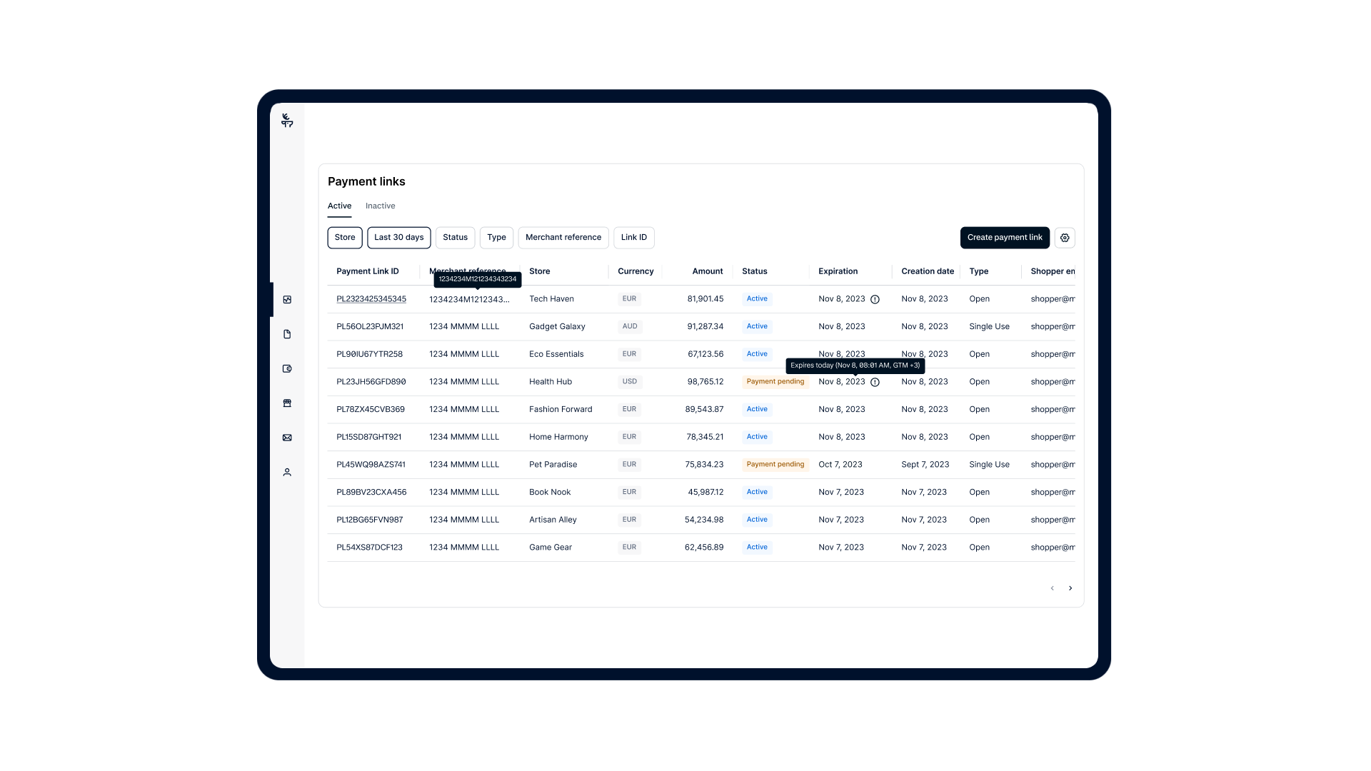](/user/pages/filters/pe-components-dashboards/pay-by-link/1-10-0/component-description/pay-by-link-active-desktop.png)
### Tab: Inactive
[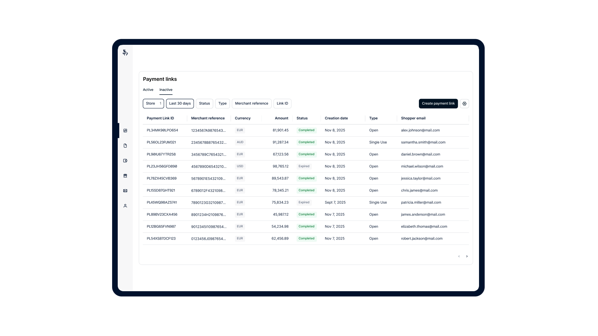](/user/pages/filters/pe-components-dashboards/pay-by-link/1-10-0/component-description/pay-by-link-inactive-desktop.png)
The **Payment Links Overview** component enables users to:
* Create new payment links to send to shoppers.
* View a list of active and inactive payment links for all or a specific store.
* Filter payment links by store, date, status, type, merchant reference, and payment link ID. See [available filters](#available-filters) for more details.
* Configure settings where your users can provide terms and conditions of their services to shoppers (this is required before you can create a payment link) and set your theme, including your brand name and logo.
By default, the **Payment Links Overview** component includes the [**Payment Link Details** ](#payment-link-details-component)component, which provides more details about a specific payment link and allows users to copy or expire a payment link. Additionally, the **Payment Links Overview** component provides access to the payment link creation flow and payment link settings.
### Available filters
The following sections shows the available filters and their values for the **Payment Links Overview** component.
**
#### Store
The **Store** filter enables users to view payment links generated for a specific store.
**
#### Time period
The **Time period** filter specifies the date and time range for displaying payment link results. The specified time is determined by the time zone of the selected balance account.
| Filter value | Description |
| ---------------- | ------------------------------------------------------------------------------------------------------------------------------------------------------------------------------------------------------------------------------------------------ |
| **Last 7 days** | Includes payment links from the previous six days and from today until the current time. For example, if today is a Tuesday and the time is 8:00 PM, payment links from the previous Wednesday midnight until this Tuesday 8:00 PM are included. |
| **This week** | Includes payment links for the current week, starting from Monday midnight until the present moment. |
| **Last week** | Includes payment links from Monday midnight to Sunday 11:59:59 PM of the previous week. |
| **Last 30 days** | The default setting. Includes payment links from the previous 29 days and from today until the current time. |
| **This month** | Includes payment links for the current month, starting from the first day of the month until today's date. |
| **Last month** | Includes payment links from the previous month, starting from the first day of the month until the end of the month at 11:59:59 PM. |
| **Custom** | Allows setting a custom time period of up to 90 days. |
**
#### Status
The **Status** filter enables users to filter the list by the current status of the payment link. Possible values are:
* **Active**: The link is live and ready to receive payments.
* **Payment pending**: The payment process has been started, but the transaction has not been confirmed as successful or failed.
* **Completed**: The payment link has successfully processed the required payment. For single use links, this status means the link is now deactivated.
* **Expired**: The link is no longer valid or usable, either because a set expiration date was reached or because the link was deactivated by the user.
**
#### Type
The **Type** filter enables users to filter payment links by their usage configuration, specifying whether the link is Single use or Open.
* **Single use**: A link that expires immediately after the first successful payment is made. It cannot be used again.
* **Open**: A link that can be used to process payments multiple times, until manually deactivated or canceled by the user.
**
#### Merchant reference
The **Merchant reference** filter enables users to filter the list by the unique reference associated with the payment.
**
#### Payment link ID
The **Payment link ID** filter enables users to filter the list by entering a unique identifier of the payment link.
## Payment Link Details component
The **Payment Link Details** component shows specific information about a payment link. Users have the ability to disable an active link, which prevents any further payments from being made with that link, or easily copy the link's URL for sharing. This component provides users with a comprehensive view of payment link details such as the payment link ID, store, merchant reference, creation, expiration dates, link type, description. It also includes shopper specific information such as shopper reference number, full name, email, email notifications, phone, country or region, shipping and billing address and status history.
By default, the **Payment Link Details** component is embedded in the **Payment Links Overview** component and is shown as a modal window on the overview page. You can also choose to show the **Payment Link Details** component on a separate page during the [initialization of the components](#initialize-components).
The following tabs illustrate how the component appears on various screen sizes.
### Tab: Mobile
[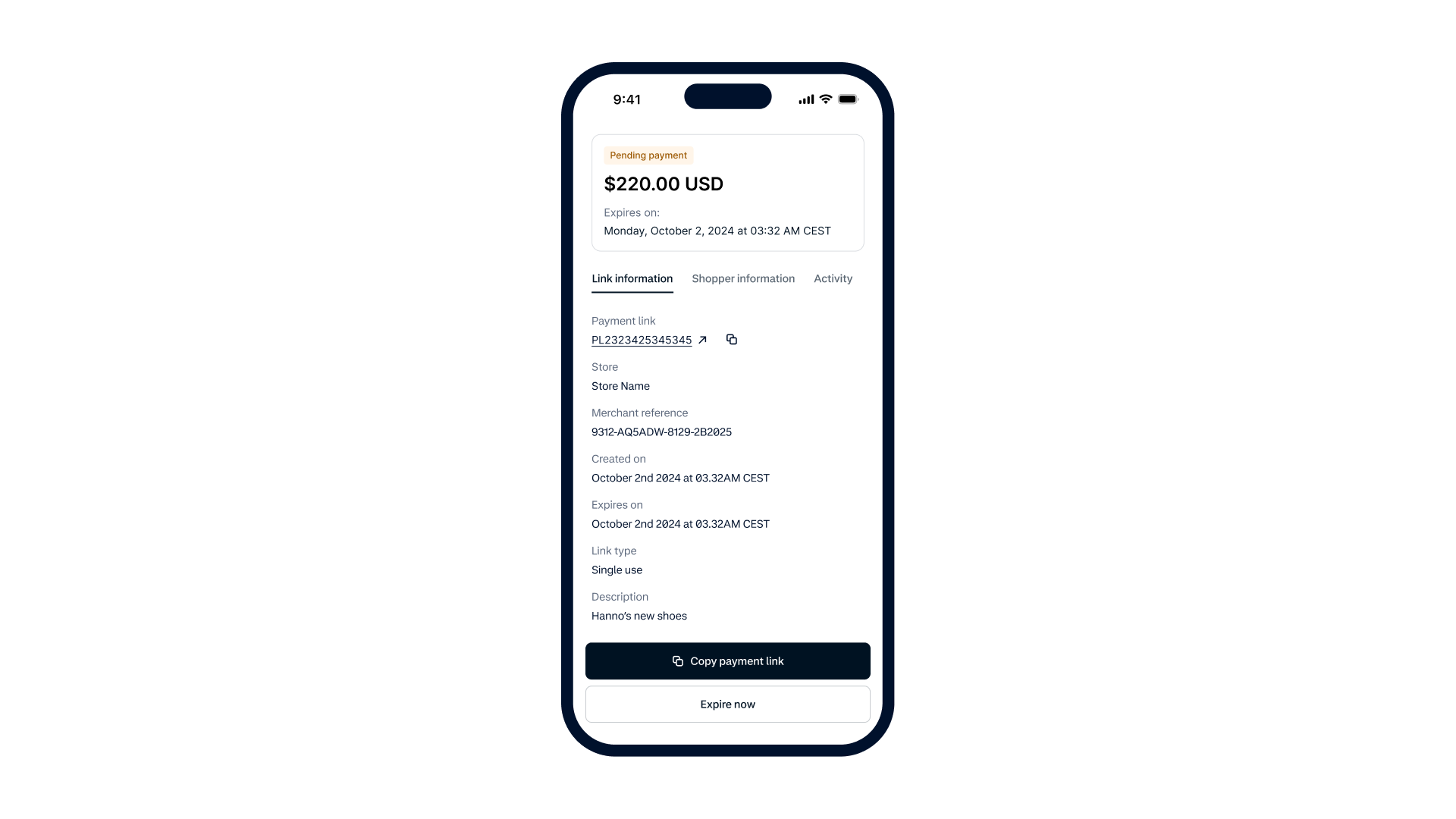](/user/pages/filters/pe-components-dashboards/pay-by-link/1-10-0/component-description/pay-by-link-details-mobile.png)
### Tab: Desktop
[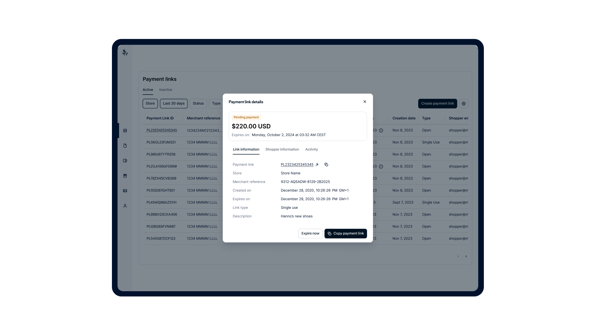](/user/pages/filters/pe-components-dashboards/pay-by-link/1-10-0/component-description/pay-by-link-details-desktop.png)
The **Payment Link Details** component enables user to:
* View detailed information about a selected payment link, including link information, shopper information, and activity.
* Expire a payment link, making it unusable for further payments.
* Copy a payment link, allowing the user to easily copy the payment link's URL to their clipboard, facilitating quick sharing via email or chat.
### Create-A-Link
## How to create a payment link through components
Users can create a new payment link directly through the Pay by Link components.
Note: The user must provide the required shopper Terms and conditions URL and confirm compliance under the [Settings](#terms-and-theme-settings) tab before a payment link can be created.
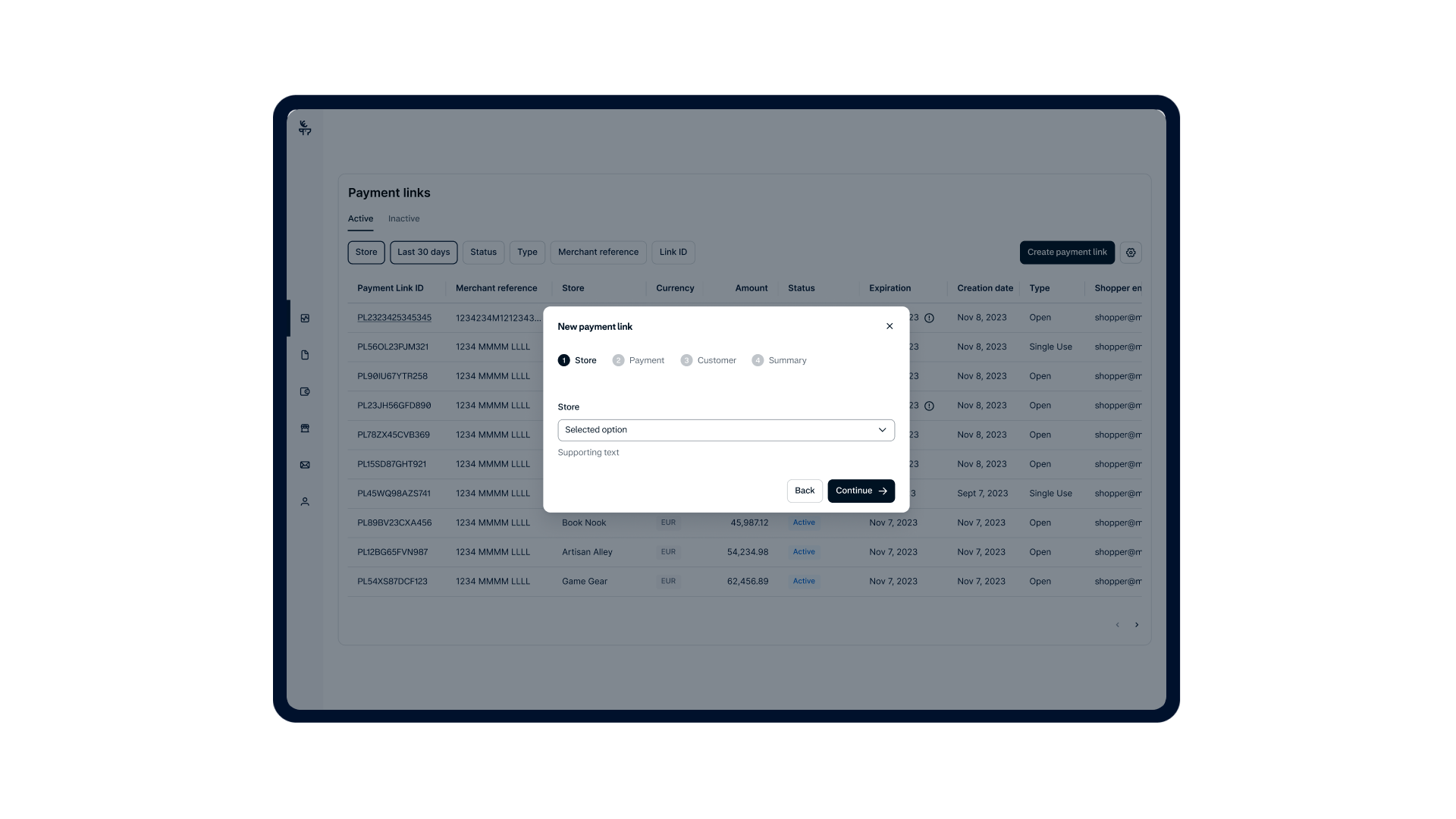
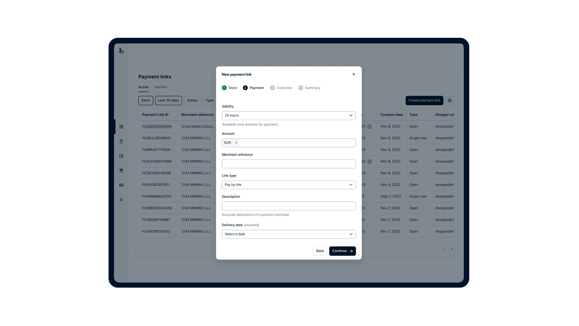
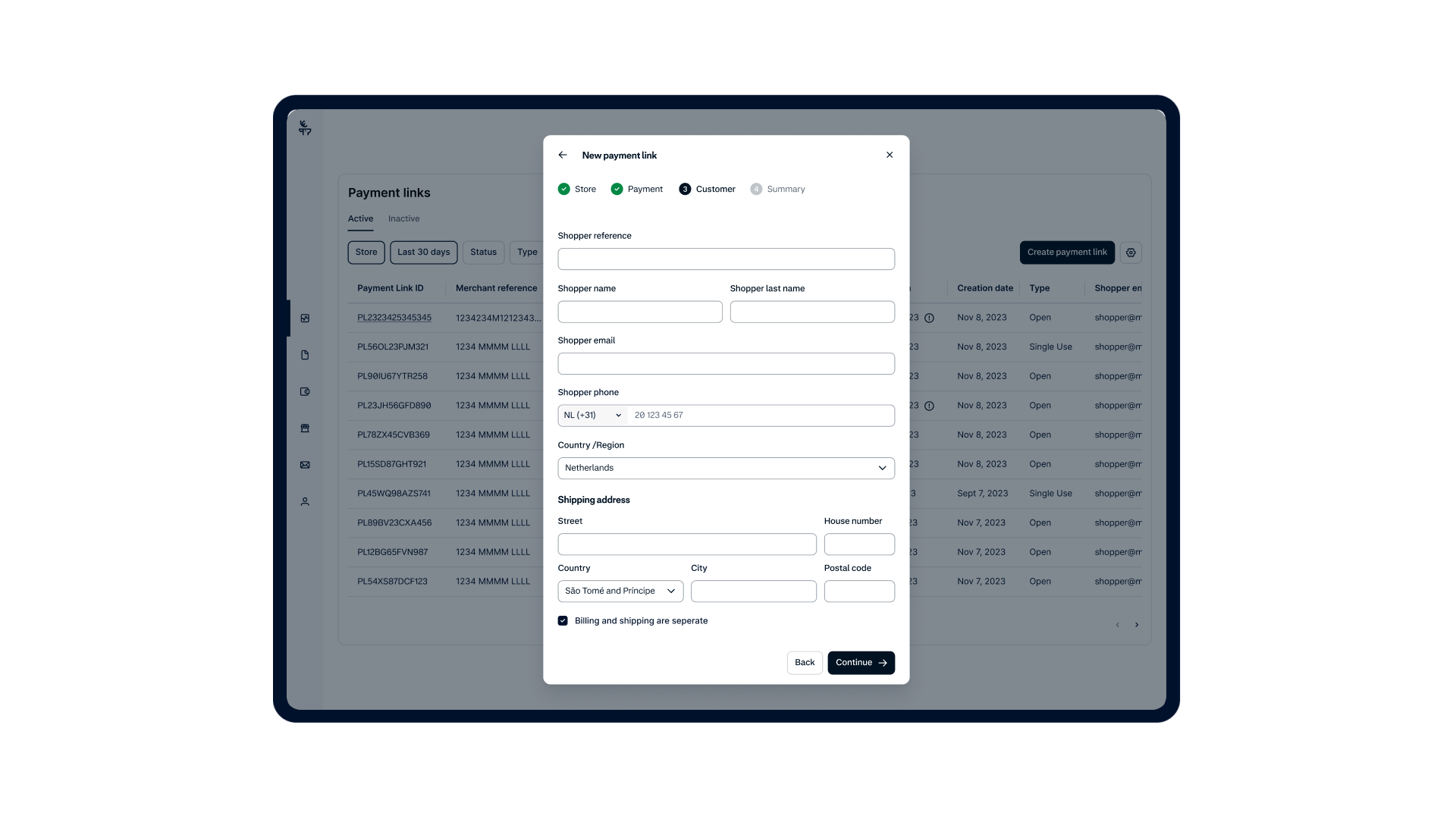
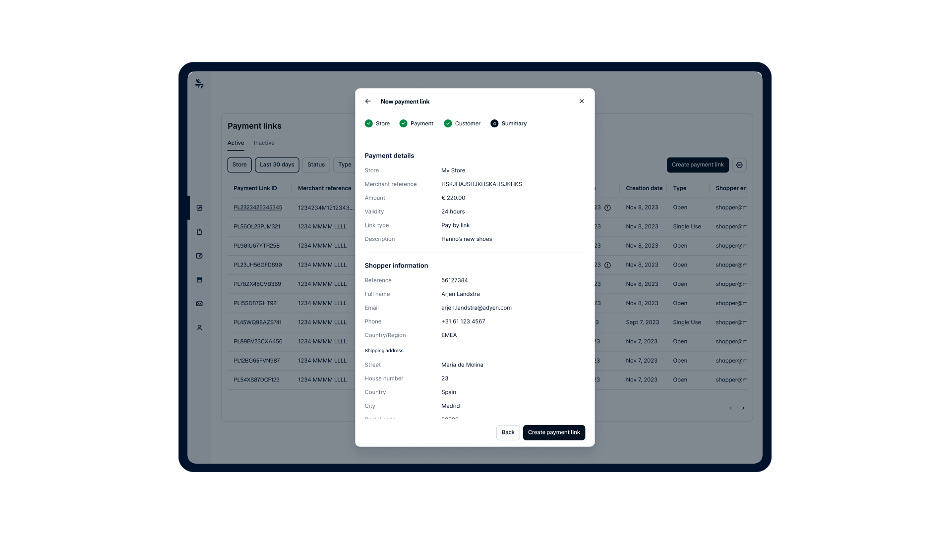
The user flow for creating a payment link through the components is as follows:
1. From the **Active** or **Inactive** tabs the user selects the **Create payment link** button, selects a **Store**, and selects the **Continue** button.
2. In the **Payment** step, the user fills in the required information and selects the **Continue** button.
3. In the **Customer** step, the user provides contact and address details and selects the **Continue** button.
4. In the **Summary** step, the user reviews all the details before generating the link. Note, that once created you will no longer be able to change the details of the payment link. To complete the process and generate the link, the user selects the **Create payment link** button.
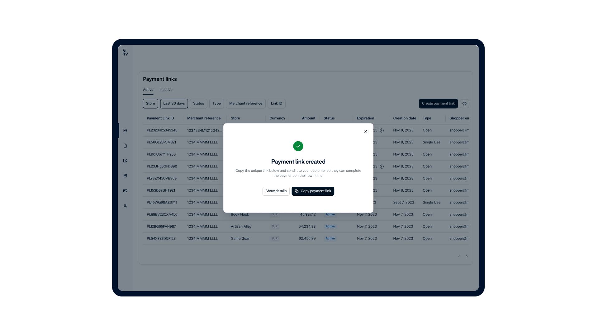
5. A confirmation screen appears to indicate the payment link has been created. At this point the user can copy the payment link to share the URL with the shopper, or they can select **Show details** to view the details.
Payment links created through this component are visible and accessible in both the component's list view and the [Customer Area](https://ca-test.adyen.com/).
### Tab: Initiate
[](/user/pages/filters/pe-components-dashboards/pay-by-link/1-10-0/create-a-link/pay-by-link-initiate.png)
### Tab: Payment details
[](/user/pages/filters/pe-components-dashboards/pay-by-link/1-10-0/create-a-link/pay-by-link-payment-details.png)
### Tab: Customer details
[](/user/pages/filters/pe-components-dashboards/pay-by-link/1-10-0/create-a-link/pay-by-link-customer-details.png)
### Tab: Review summary
[](/user/pages/filters/pe-components-dashboards/pay-by-link/1-10-0/create-a-link/pay-by-link-review-summary.png)
### Tab: Share
[](/user/pages/filters/pe-components-dashboards/pay-by-link/1-10-0/create-a-link/pay-by-link-share.png)
### Configure-Settings
## Terms and theme settings
The settings area of the **Payment Links Overview** component is where your users must complete the initial requirements and can optionally customize the shopper's payment experience.
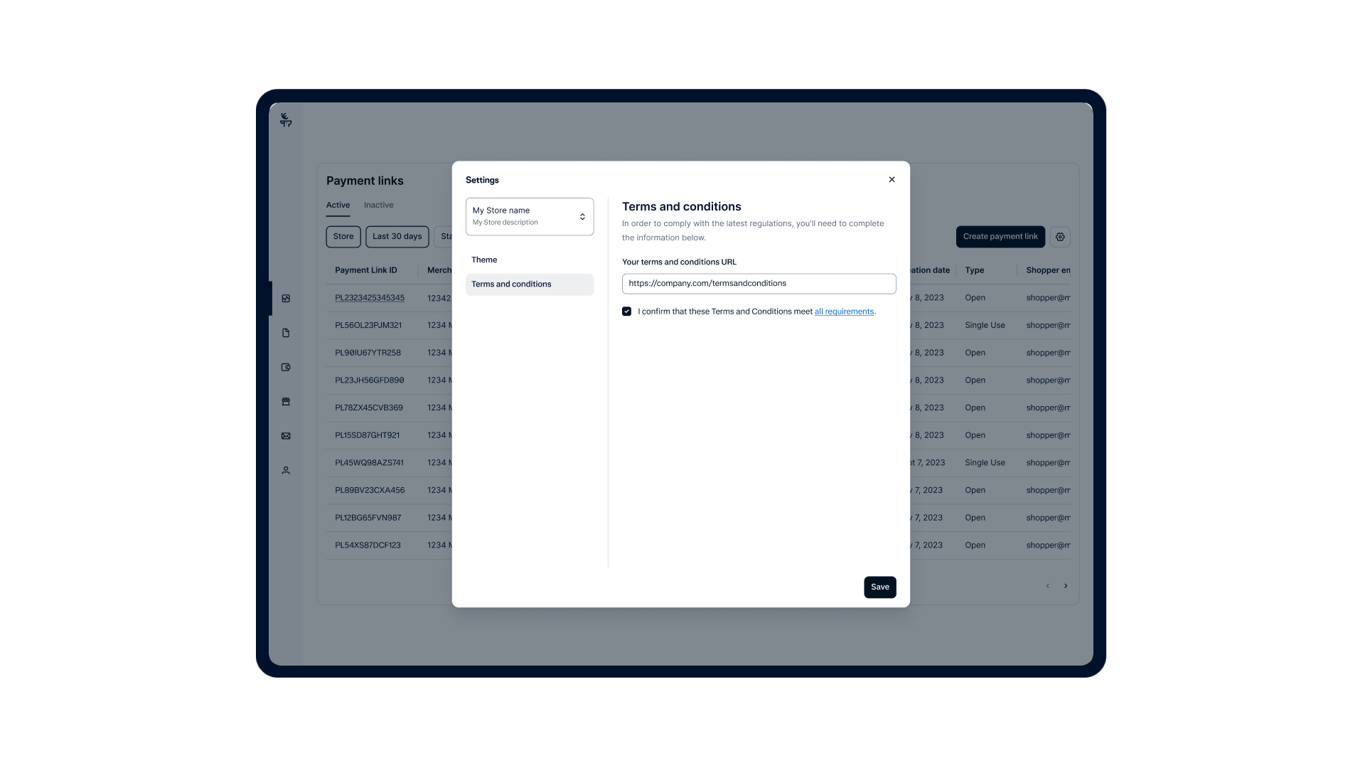
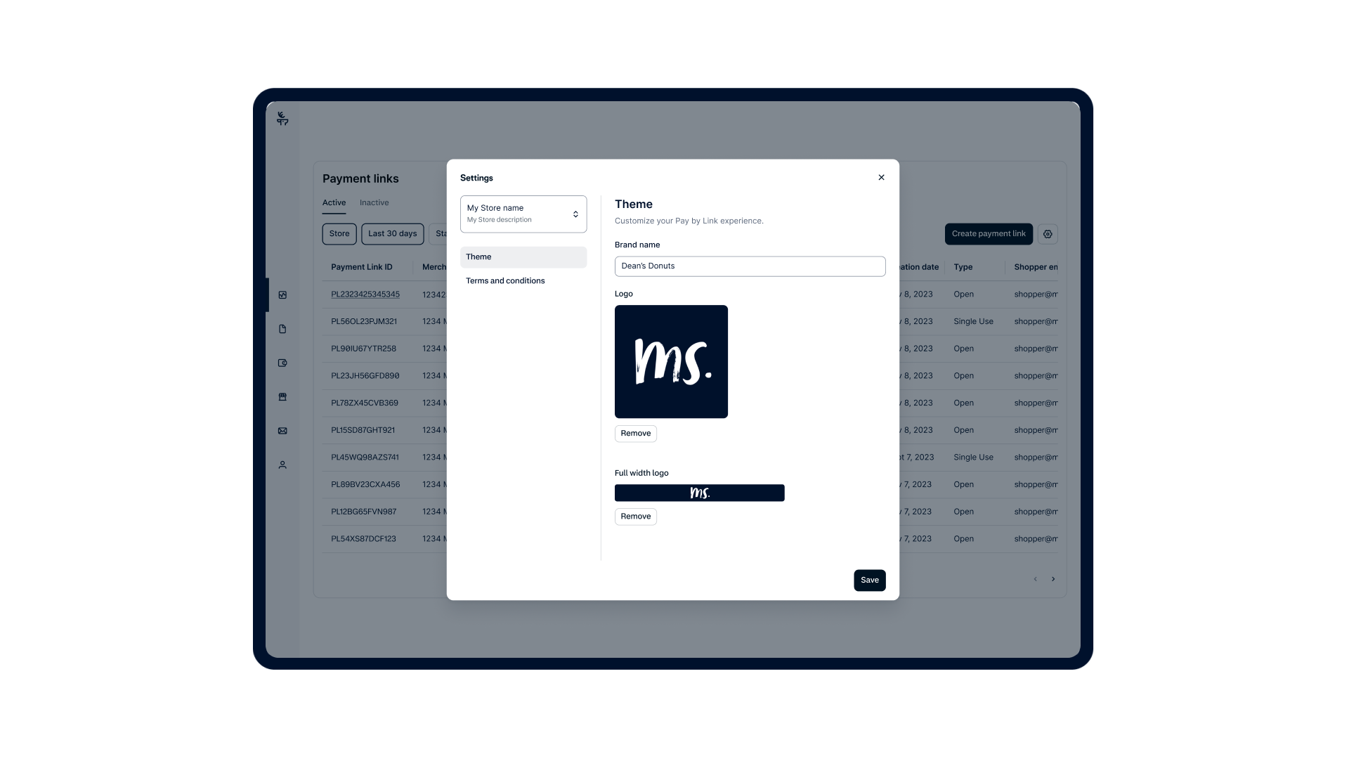
The settings menu contains two items that are managed per store: **Themes** and **Terms and conditions**. For each store selected, the your user can set or edit the following items:
* **Terms and conditions**: Your users must provide a terms and conditions URL that satisfies all the [required information](/unified-commerce/pay-by-link#terms-and-conditions-requirements). This step is required before your users can create their first payment link, as consumer law and scheme regulations require your users to inform shoppers of the applicable terms. Only one terms and conditions URL is allowed per store.
* **Themes**: Your users can set a theme and customize the appearance of the payment page that shoppers see, which includes configuring a brand name and uploading a logo. Your users are limited to two logo options: Full-width and standard logo, both with specified constraints. Only one theme is allowed per store.
### Tab: Terms and conditions
[](/user/pages/filters/pe-components-dashboards/pay-by-link/1-10-0/configure-settings/pay-by-link-terms-conditions.png)
### Tab: Themes
[](/user/pages/filters/pe-components-dashboards/pay-by-link/1-10-0/configure-settings/pay-by-link-themes.png)
## How it works
The integration of components involves both server-side and client-side processes. You can find more details on the [component libraries](#see-also) page.
### Integration steps
Follow these steps to integrate the component(s):
1. [Create an authentication session from your server](#create-token)
2. [Install component library in your front end](#install-library)
3. [Initialize components](#initialize-components)
4. [Optional: Localize components](#localize-components)
5. [Optional: Customize component appearance](#customize-appearance)
### Create A Session
## 1. Create an authentication session from your server
To ensure secure communication between components and Adyen server, you must configure your server for authentication and create a session token. To create the token:
1. From your server, make a POST [/sessions](https://docs.adyen.com/api-explorer/sessionauthentication/latest/post/sessions) request specifying the following parameters:
To make this API request, your API key must have the **Pay By Link Component: View** role in your Customer Area. For more information, refer to the [Requirements](#requirements) section.
| Parameter | Required | Description |
| ----------------------------------------------------------------------------------------------------------------- | ------------------------------------------------------------------------------------------- | ------------------------------------------------------------------------------------------------------------------------------------------------------------------------------------------------------------------------------------------------------------------------------------------------------------------------------------------------------------------------------------------------------------------------------------------------------------------------------------------------------------------------------------------------------------------------------------------------------------------------------------------------------------------------------------------------------------------------------------------------------------------------------------------------------------------------------------------------------------------------------------------------------------------------------------------------------------------------------------------------------------------------------------------------------------------------------------------------------------------------------------------------------------------------------------------------- |
| [allowOrigin](https://docs.adyen.com/api-explorer/sessionauthentication/latest/post/sessions#request-allowOrigin) |  | The URL where the component will appear. Must follow the format of `https://www.yourcompany.com` or `https://*.yourcompany.com`, where `yourcompany.com` is the actual web address of your marketplace. On live, only the HTTPS protocol is supported. |
| [policy](https://docs.adyen.com/api-explorer/sessionauthentication/latest/post/sessions#request-policy) |  | An object that contains:- [resources](https://docs.adyen.com/api-explorer/sessionauthentication/latest/post/sessions#request-policy-resources): An object that contains:
* `accountHolderId`: The unique identifier of the account holder that is linked to the stores and associated with the payment links in the component.
* [type](https://docs.adyen.com/api-explorer/sessionauthentication/latest/post/sessions#request-policy-resources-type): The type of resource. Set this to **accountHolder**.
- [roles](https://docs.adyen.com/api-explorer/sessionauthentication/latest/post/sessions#request-policy-roles): The roles required to use the component:
* Include the **Pay By Link Component: View** to enable users to view payment links only.
- Include the **Pay By Link Component: View PII** to enable users to view Personally Identifiable Information (PII).
* Include the **Pay By Link Component: Manage Links** role to allow the user to view, create, and deactivate payment links.
- Include the **Pay By Link Component: Manage Settings** role to grant the user full administrative control over component configuration, themes, and settings. |
| [product](https://docs.adyen.com/api-explorer/sessionauthentication/latest/post/sessions#request-product) |  | The type of product the component belongs to. Set this to **platform**. |
Here is an example request for creating a session token.
**Create a session token**
```bash
curl https://test.adyen.com/authe/api/v1/sessions \
-H 'content-type: application/json' \
-H 'x-api-key: ADYEN_BALANCE_PLATFORM_API_KEY' \
-d '{
"allowOrigin":"YOUR_DOMAIN",
"product":"platform",
"policy": {
"resources": [
{
"accountHolderId": "AH00000000000000000000001",
"type": "accountHolder"
}
],
"roles": [
"Pay By Link Component: View",
"Pay By Link Component: View PII",
"Pay By Link Component: Manage Links",
"Pay By Link Component: Manage Settings"
]
}
}'
```
2. Note the API response. Later, when [initializing the components](#initialize-components), you need to create and call a function that passes the entire session object from the response to your front end.
**Session token created**
```json
{
"id": "EC1234-1234-1234-1234",
"token": "xxxxx.yyyyy.zzzzzz"
}
```
### Install Component Library
## 2. Install component library in your front end
Use the Adyen Web npm package, or embed the Adyen Platform Experience script and stylesheet into your HTML file:
### Tab: npm (recommended)
Install the **Adyen Platform Experience** library in your front-end application as follows:
1. Install the npm package.
```bash
npm install @adyen/adyen-platform-experience-web
```
2. Import the library, the components, and the style sheet.
```bash
import { AdyenPlatformExperience, component_name } from '@adyen/adyen-platform-experience-web';
import "@adyen/adyen-platform-experience-web/adyen-platform-experience-web.css";
```
### Tab: Embed script and stylesheet
Use the `integrity` attribute so browsers can verify that the script and stylesheet have not been changed unexpectedly.
The value of the `integrity` attribute is the [Subresource Integrity (SRI) hash](https://developer.mozilla.org/en-US/docs/Web/Security/Subresource_Integrity) which Adyen provides for each version of the Adyen Web JavaScript and CSS files.
Get the SRI hashes from the [release notes](/release-notes/platforms-and-financial-products) for the Platform Experience components, under **Updating to this version**.
**embed-script-stylesheet.html**
```html
```
### Initialize Components
## 3. Initialize components
To initialize the components:
1. Gather the following information to be passed when initializing the library and its components.
1. Gather these parameters to initialize the library.
| Parameter | Required | Description |
| --------------------------------- | ------------------------------------------------------------------------------------------- | -------------------------------------------------------------------------------------------------------------------------------------------------------------------------------------------------------------------------------------------------------------------------------------------------------- |
| `availableTranslations`Deprecated | | **Deprecated.** This field is no longer needed because locales are now dynamically loaded on demand via CDN. Setting this field will trigger a deprecation warning. An array containing the names of the imported locale files used for localizing the components. For example, `[es_ES, nl_NL, fr_FR]`. |
| `environment` | | Specifies the environment for the component integration. The default value is **test**. Set the parameter to **live** when you are ready to go live. |
| `locale` | | Specifies the locale code, which determines the desired language of the components. This code must correspond to a [supported language](#supported-languages). For example, use **es-ES** for Spanish. |
| `onSessionCreate` |  | The callback function that retrieves an authentication session token and refreshes the current session. |
2. Gather these parameters to initialize each component.
Select the tab for the component you want to use:
### Tab: Payment Links Overview component
| Parameter | Required | Description |
| --------------------- | ------------------------------------------------------------------------------------------- | -------------------------------------------------------------------------------------------------------------------------------------------------------------------------------------------------------------------------------------------------------------------------------------------------------------------------- |
| `allowLimitSelection` | | Determines whether the user can change the number of payment links shown per page. Default value: **true**. |
| `core` |  | The instance of the library. |
| `onRecordSelection` | | If defined, the event allows obtaining the payment link ID when the user selects a specific payment link from any tab of the overview. You can use the obtained ID value to show the **Payment Link Details** component in a different location within your portal's UI, outside the **Payment Links Overview** component. |
| `preferredLimit` | | The number of payment links shown per page. Default value: **10**. |
### Tab: Payment Link Details component
| Parameter | Required | Description |
| --------- | ------------------------------------------------------------------------------------------- | ------------------------------------------ |
| `core` |  | The instance of the library. |
| `id` |  | The unique identifier of the payment link. |
3. Select the tab for the feature you want to use:
### Tab: Payment Link creation
| Parameter | Required | Description |
| ---------------------- | ------------------------------------------------------------------------------------------- | ----------------------------------------------------------------------------------------------------------------------------------------------------------------------------------------------------------------------------------------------------------------------------------------------------------------- |
| `core` |  | The instance of the library. |
| `fieldsConfig` | | A configuration object used to prefill the payment link form and control field visibility. See [details below](#prefill-data). |
| `onPaymentLinkCreated` | | If defined, this event triggers upon the successful creation of a payment link by the user, providing the complete payment link details along with the unique payment link ID. The obtained ID value can be used to send an email to the shopper or show details in a different location within your portal's UI. |
### Tab: Payment Link Settings
| Parameter | Required | Description |
| --------- | ------------------------------------------------------------------------------------------- | ---------------------------- |
| `core` |  | The instance of the library. |
2. Create a DOM element on your portal's UI page where you want the component to be rendered.
Assign the element a unique and descriptive ID. This unique ID is important to avoid any misconfigurations when integrating multiple components into your portal's UI.
By default, the **Payment Link Details** component is shown as a modal window within the **Payment Links Overview** component. In this scenario, you only need to create a DOM element for the **Payment Links Overview** component. If you want to use the **Payment Link Details** component on its own, you need to create a separate DOM element for it.
If you are using JavaScript frameworks such as Vue or React, make sure that you use references instead of selectors and that you do not re-render the DOM element.
1. Select the tab for the component you want to use:
### Tab: Payment Links Overview component
**Create DOM element**
```html
```
### Tab: Payment Link Details component
**Create DOM element**
```html
```
2. Select the tab for the feature you want to use:
### Tab: Payment Link creation
**Create DOM element**
```html
```
### Tab: Payment Link settings
**Create DOM element**
```html
```
3. Add a function that [calls your API](#create-token) to retrieve and refresh an authentication session token.
The following code is the same for both **Pay by Link** components.
**Add function to retrieve and refresh an authentication session token**
```bash
async function handleSessionCreate() {
const response = await fetch('YOUR_IMPLEMENTATION_OF_CREATE_SESSION_ENDPOINT');
return response.json();
}
```
4. Initialize the component and mount it to the container you created.
Be sure to include the function for retrieving and refreshing the session token that you added in the previous step.
To implement the **Payment Link Details** component as a modal window within the **Payment Links Overview** component, use the following code examples. In this implementation, when a user selects a specific payment link from the overview page, the payment link ID is automatically passed to the **Payment Link Details** component, and the modal window opens.
1. Select the tab for the component you want to use:
### Tab: Payment Links Overview component
**Initialize library and create component**
```javascript
import { AdyenPlatformExperience, PaymentLinksOverview } from '@adyen/adyen-platform-experience-web';
import "@adyen/adyen-platform-experience-web/adyen-platform-experience-web.css";
const core = await AdyenPlatformExperience({
onSessionCreate: handleSessionCreate,
});
const paymentLinksOverview = new PaymentLinksOverview({ core });
paymentLinksOverview.mount('#payment-links-overview-container');
```
### Tab: Payment Link Details component
**Initialize library and create component**
```javascript
import { AdyenPlatformExperience, PaymentLinkDetails } from '@adyen/adyen-platform-experience-web';
import "@adyen/adyen-platform-experience-web/adyen-platform-experience-web.css";
const core = await AdyenPlatformExperience({
onSessionCreate: handleSessionCreate,
});
const paymentLinkDetails = new PaymentLinkDetails({
core,
id: 'ABCDEFG1234567890'
});
PaymentLinkDetails.mount('#payment-link-details-container');
```
2. Select the tab for the feature you want to use:
### Tab: Payment Link creation
**Payment Link creation**
```javascript
import { AdyenPlatformExperience, PaymentLinkCreation } from '@adyen/adyen-platform-experience-web';
import "@adyen/adyen-platform-experience-web/adyen-platform-experience-web.css";
const core = await AdyenPlatformExperience({
onSessionCreate: handleSessionCreate,
});
const paymentLinkCreation = new PaymentLinkCreation({
core,
});
PaymentLinkCreation.mount('#payment-link-creation-container');
```
### Tab: Payment Link settings
**Payment Link settings**
```javascript
import { AdyenPlatformExperience, PaymentLinkSettings } from '@adyen/adyen-platform-experience-web';
import "@adyen/adyen-platform-experience-web/adyen-platform-experience-web.css";
const core = await AdyenPlatformExperience({
onSessionCreate: handleSessionCreate,
});
const paymentLinkSettings = new PaymentLinkSettings({
core,
});
PaymentLinkSettings.mount('#payment-link-settings-container');
```
5. (Optional) To use the **Payment Link Details** component outside of the **Payment Links Overview** component:
1. Define the `onRecordSelection` callback.
**Define onRecordSelection callback**
```javascript
const paymentLinksOverview = new PaymentLinksOverview({
core,
onRecordSelection: ({ id }) => {
// Use selected payment link id.
}
});
```
2. Initialize the **Payment Link Details** component using the `id` from the object argument as shown below.
**Link to the selected record**
```javascript
const paymentLinkDetails = new PaymentLinkDetails({
core,
id: ''
});
```
### Localize Components
## 4. Optional: Localize components
During the [component initialization](#initialize-components), you can also configure the components to use one of the [supported languages](#supported-languages).
Update your code for initializing components to include the localization settings. If no localization settings are provided, the components will default to English.
**Localize components**
```javascript
import { AdyenPlatformExperience } from '@adyen/adyen-platform-experience-web';
const core = await AdyenPlatformExperience({
locale: 'es-ES', // See supported languages for possible values
/* ... */
});
```
### Customize Appearance
## 5. Optional: Customize component appearance
The pay-by-link components have a default appearance with pre-defined styles, such as colors, fonts, and borders. You can customize the appearance of your components by overriding the default values of CSS variables and the class settings:
1. Inspect the components using your browser's developer tools.
2. Modify the styles in your style sheet file.
The following tabs show examples of how to style the components. The first example shows how to override predefined CSS variables to use different colors and values. The second example demonstrates how to update the CSS class setting to change the layout of the modal window from a pop-up window to a side panel view.
### Tab: Example 1: Override CSS variables
**style.css**
```bash
:root {
--adyen-sdk-border-radius-s: 10px;
--adyen-sdk-border-radius-m: 20px;
--adyen-sdk-border-radius-l: 30px;
--adyen-sdk-color-background-disabled: #9ecdb1;
--adyen-sdk-color-background-inverse-primary: #0abf53;
--adyen-sdk-color-background-inverse-primary-hover: #57d389;
--adyen-sdk-color-decorative-blue: #0abf53;
--adyen-sdk-color-outline-primary-active: #0abf53;
}
```
### Tab: Example 2: Update CSS class settings
**style.css**
```bash
.adyen-pe-modal {
border-left: 3px solid #0abf53;
border-radius: 0;
height: 100%;
max-height: unset;
right: 0;
}
```
### Prefill-Data
## 6. Optional: Pre-populate component data
The `fieldsConfig` object allows you to pre-populate the payment link creation form, set fields to a **readOnly** state to restrict user editing, and control the visibility of individual fields.
The object accepts two optional parameters:
| Parameter | Description |
| ------------ | -------------------------------------------------------------------------------------------------------------------------------------------------------------------------------------------------------------------- |
| `data` | Contains the values used to pre-populate any subset of supported fields. |
| `visibility` | Sets field behavior to either **readOnly** (visible but locked) or **hidden** (removed from the UI, but still validated). If a key is missing from the `visibility` object, the field defaults to an editable state. |
Use the following structure to define your `fieldsConfig` object:
**Initial structure**
```json
{
"data": {
"shopperEmail": "shopper@example.com",
"telephoneNumber": "+31 0690758074"
},
"visibility": {
"shopperEmail": "readOnly",
"telephoneNumber": "hidden"
}
}
```
### Targetable fields and subfields
The following example shows the object structure and all fields available for pre-population or restriction within `fieldsConfig`. You can target top-level fields or specific sub-fields. To do this, see [Field visibility settings notation](#field-visibility-settings-notation).
**Targetable fields and subfields**
```json
{
"data": {
"amount": {
"currency": "EUR", // Three letter currency code
"value": 10000 // 100 EUR with 2 decimals
},
"deliveryAddress": {
"city": "Amsterdam",
"country": "NL", // Two letter country code (ISO 3166-1 alpha-2)
"houseNumberOrName": "136",
"postalCode": "1011DJ",
"street": "Simon Carmiggeltstraat"
},
"billingAddress": {
"city": "Medellin",
"country": "CO", // Two letter country code (ISO 3166-1 alpha-2)
"houseNumberOrName": "201",
"postalCode": "05001",
"street": "Calle 25 #34-12"
},
"description": "This is a test description",
"reference": "MER-000001", // Merchant Reference
"deliverAt": "2025-12-09T11:39:24.458Z",
"shopperEmail": "shopper@example.com",
"shopperLocale": "en-US",
"shopperReference": "SHP-000001",
"shopperName": {
"firstName": "John",
"lastName": "Doe"
},
"countryCode": "ES", // Two letter country code (ISO 3166-1 alpha-2)
"telephoneNumber": "+31 0690758074", // Format: +
"linkValidity": {
"durationUnit": "week", // minute, hour, day, week
"quantity": 3
}
},
"visibility": {
"amount": {
"value": "readOnly",
"currency": "readOnly"
},
"deliveryAddress": {
"city": "readOnly",
"country": "readOnly",
"houseNumberOrName": "readOnly",
"postalCode": "readOnly",
"street": "readOnly"
},
"billingAddress": "readOnly",
"description": "hidden",
"reference": "hidden",
"deliverAt": "hidden",
"shopperEmail": "readOnly",
"shopperLocale": "readOnly",
"shopperReference": "hidden",
"shopperName": "hidden",
"countryCode": "readOnly",
"telephoneNumber": "readOnly",
"linkValidity": {
"durationUnit": "readOnly",
"quantity": "readOnly"
}
}
}
```
### Field requirements and constraints
When pre-populating data, ensure that you follow these specific formats:
| Fields | Type | Description |
| ------------------ | ------- | -------------------------------------------------------------------------------------------------------------------------------------------------------------------------------------------- |
| `currency` | string | The three-character [ISO currency code](/development-resources/currency-codes#currency-codes) of the amount. |
| `value` | string | The numeric value of the amount, in [minor units](/development-resources/currency-codes#minor-units). |
| `country` | string | The two-letter country code, in [ISO 3166-1 alpha-2](https://en.wikipedia.org/wiki/ISO_3166-1_alpha-2) format. Used in `billingAddress` and `deliveryAddress`. |
| `deliverAt` | string | The date and time when the purchased goods should be delivered. [ISO 8601](https://www.w3.org/TR/NOTE-datetime) format: **YYYY-MM-DDThh:mm:ss+TZD**, for example, 2020-12-18T10:15:30+01:00. |
| `shopperLocale` | string | The combination of a language code and a country code to specify the [language](/unified-commerce/pay-by-link/create-payment-links/api#language) to be used. |
| `telephoneNumber` | string | The shopper's telephone number. Must include a "+" prefix, country code, and a space before the number (for example, +31 0690758074). |
| `durationUnit` | string | The duration of the payment link validity. Possible values: **minute**, **hour**, **day**, **week**. |
| `quantity` | integer | The numerical value of the duration of the payment link validity, in terms of the defined `durationUnit`. |
| `reference` | string | The reference to uniquely identify your user. |
| `shopperReference` | string | The reference to uniquely identify this shopper. |
### Field visibility settings notation
When setting the visibility of fields, you can either apply a rule to a top-level field (which affects all its nested properties) or target specific sub-fields individually.
| Notation | Usage | Example |
| -------- | --------------------------------------------------------- | ------------------------------------------ |
| string | Applies one rule to an entire top-level field (fieldset). | `"billingAddress": "readOnly"` |
| object | Applies different rules per individual sub-field. | `"billingAddress": { "city": "readOnly" }` |
Individual address fields cannot be set to **hidden**. This rule must be applied to the entire fieldset (for example, `billingAddress` or `deliveryAddress`). This restriction exists because if any field within an address fieldset is populated, all other fields are also required to have a value for validation.
#### Common use cases
| Use case | Data | Visibility/State |
| ------------------------------------------ | ----------------------------------------------------------------------------------------------------------------------------------------------------------- | ----------------------------------------------- |
| Pre-populate shopper details, allow edits. | Provide values for specific fields, for example `shopperEmail`). | Omit the field or object. |
| Pre-populate and lock addresses. | Provide values, for example `billingAddress` or `deliveryAddress`. In this case, provide all required sub-fields for `billingAddress` or `deliveryAddress`. | Set to **readOnly**. |
| Hide optional sections. | Provide values for the field for required for validation. | Set the specific object or field to **hidden**. |
#### Example configurations
This example shows how to pre-populate an address, transaction amount, and phone number, while you lock the address and hide the `shopperReference` field.
**Pre-populate and lock billing data**
```json
{
"data": {
"billingAddress": {
"city": "Amsterdam",
"country": "NL",
"houseNumberOrName": "136",
"postalCode": "1011DJ",
"street": "Simon Carmiggeltstraat"
},
"amount": {
"value": 12500,
"currency": "EUR"
},
"telephoneNumber": "+31 0690758074",
"shopperReference": "SHP-000001"
},
"visibility": {
"billingAddress": "readOnly",
"amount": {
"currency": "readOnly"
},
"shopperReference": "hidden"
}
}
```
This example shows how to lock specific fields. Note that individual address sub-fields remain **readOnly** per the validation requirements.
**Mixed visibility on nested fields**
```json
{
"visibility": {
"deliveryAddress": {
"country": "readOnly",
"postalCode": "readOnly"
},
"linkValidity": "hidden"
}
}
```
#### Usage tips
* **Pre-populate locked fields**: A read-only input without data is confusing. Always provide values for locked fields.
* **Hidden are not optional**: Validation still runs on **hidden** fields. You must provide valid values via `data` for any required fields you hide.
* **Match compliance policies**: Hide or lock fields that must not be edited based on your specific compliance requirements.
## Supported languages
You can set one of the following languages to localize any of the Platform Experience components.
| Language | Locale code | Locale file |
| --------------- | ----------- | ----------- |
| Danish | **da-DK** | **da\_DK** |
| Dutch | **nl-NL** | **nl\_NL** |
| English | **en-US** | **en\_US** |
| Finnish | **fi-FI** | **fi\_FI** |
| French | **fr-FR** | **fr\_FR** |
| German | **de-DE** | **de\_DE** |
| Italian | **it-IT** | **it\_IT** |
| Norwegian | **no-NO** | **no\_NO** |
| Portuguese (BR) | **pt-BR** | **pt\_BR** |
| Spanish | **es-ES** | **es\_ES** |
| Swedish | **sv-SE** | **sv\_SE** |
## See also
* [Component libraries](/platforms/components-overview)